


If you have recently simplified your home office, you probably noticed how wonderfully calm it is. Clear surfaces, neutral colors, and fewer visual distractions create a space that is easy to settle into. However, while it may feel and look great, you might start to feel like something is missing after a few days. The room may start to feel a little too flat.
Adding more decoration may seem like a sensible solution, but you don’t want to do that as it can quickly disrupt the sense of calm. Instead of filling the room with too many objects, patterns, and finishes, it’s best to introduce interest through a few deliberate points of contrast. In this guide, we’ll explain how to introduce visual depth through a few deliberate contrasts, without filling every empty space.
Start with One Textured Focal Point
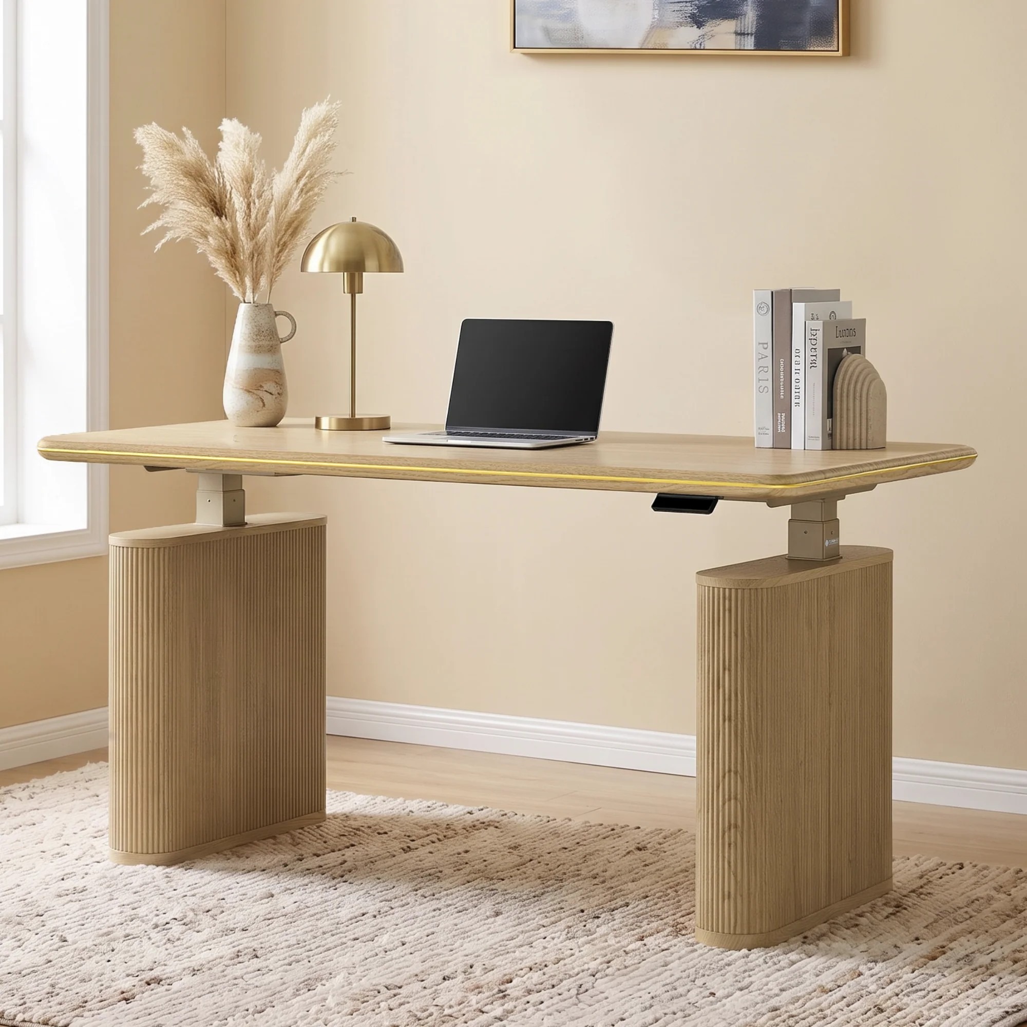
When your home office feels visibly plain, a statement piece can become a main point of interest without creating too much distraction. For instance, you can add the Opal Aurelia fluted standing desk by Eureka Ergonomic as your focal point. Its fluted detailing creates a repeated vertical rhythm, while the rounded outline gives the overall form a softer appearance. Against a neutral backdrop, these details can add character without introducing a bold color.
The key is to let the texture breathe. Rather than surrounding it with more statement pieces, allow the desk to become one clear visual anchor.
Contrast Texture with Something Smooth
Sometimes it might be tempting to repeat an interesting finish. A fluted desk might lead to another ribbed accessory, a patterned storage box, or a heavily textured lamp. While it can work sometimes, repeating the same visual language can make the room feel busier than intended.
You may choose to place the Aurelia beside something smooth, such as a simple lamp with a clean shade to create contrast. The smooth surface gives the eye somewhere to rest, making the fluting more noticeable without making it feel excessive. The same principle applies to the desktop. You want to keep accessories relatively simple, allowing the desk’s vertical texture to remain visible.
Let a Woven Textile Echo the Wood Tone

A low-pile woven throw draped over a nearby chair can loosely echo the natural oak finish and its visible grain without matching it exactly. A similar warm tone helps the textile feel connected to the desk, while slight differences keep the room from looking overly coordinated. The weave also introduces a softer texture against the desk’s structured fluting, giving the space another layer of contrast without adding visual clutter.
Pause Before You Add Anything Else
It can be tempting to keep going with another textured object: perhaps add a patterned rug or a gallery wall. However, you want to pause at this point. The desk’s fluted base already carries visual weight, so the surrounding space benefits from staying open rather than feeling filled. An uncluttered desktop does the same on a smaller scale, allowing the wood grain and fluting to remain visible without competing with a collection of accessories.
The desk’s hidden cable management and accessible height adjustment also support an orderly look without demanding attention. These practical details work best when they stay in the background.
Endnote

Walk back into your home office, and the difference isn’t dramatic, and that’s the point. The walls are the same neutral, and the layout hasn’t changed. What’s different is a handful of deliberate contrasts. A calm room doesn’t need more objects; it needs a few textures that work well together.
0
Related
Read the full article here