


COAT just launched 33 new paint shades which is the brand’s biggest release to date. And all the Brits and UK residents alike will be happy to know that each of these colours is designed specifically to work with the UK’s lighting – or lack thereof, some might say.
COAT is one of those cool brands that sets paint trends for the rest of us to follow. So I fully expect to be seeing all of the new shades popping up everywhere soon, similarly to Farrow & Ball’s new shades released just a couple of months ago.
The new colour palette is largely made up of easy-to-use neutrals, as well as earthy tones which are all the rage this year. But it also fills a big gap in COAT’s colour offering which is yellow, including five new yellow paint shades in this drop – and it’s right on time as butter yellow is one of the biggest colour trends of this year.
‘Yellow was a big gap for us,’ says Rob Abrahams, COAT co-founder. ‘It’s a notoriously tricky colour; often too bright, too pastel, or too cold for UK homes. We’ve created yellow tones that feel mature and usable, even in dim or north-facing rooms.’
How do the shades work with UK lighting?
It’s all about getting the tones and undertones of the paint shades right based on the typical cold and overcast weather we’re used to in the UK, according to Rob at COAT. He says the new paint shades are designed to ‘work beautifully with UK lighting, which is typically cool and diffused; think overcast skies, north-facing rooms, and low winter sun.’
He continues, ‘That means avoiding bright, synthetic shades that can look jarring or flat in those conditions. Instead, we focus on muted, desaturated tones with just a touch of black pigment to “hush” the colour. It gives the shade a softness and depth that shifts subtly throughout the day, always feeling sophisticated and livable.
Each new colour is tested in different spaces and lighting scenarios to make sure it holds up naturally and never feels too cold or too bold.’
What to expect from the new range?
To be perfectly clear, only 19 of the colours are brand new. The other 14 are reintroduced shades from previous collaborations or limited editions – 9 of which come from the popular partnership with Jojo Barr of House Nine Design, including one of my personal favourites, the Spanked shade described as burnt terracotta red – which have proven so popular that the brand decided to make a permanent space for them in its core range.
Apart from developing its yellow offering, COAT is also adding to its browns and greens, the latter of which always proves to be amongst the most popular shades, always making an appearance in previous collaborations like the one with Coat Paint collaboration with Stacey Dooley.
‘As always, the green tones like Jonah and Retrograde are gaining traction, green is consistently one of our strongest categories,’ Rob says.
‘Sybil is an early favourite. We’re also seeing strong momentum behind our take on yellow, particularly Cheap Soufflé and Gwen. They’ve got that “butter yellow” appeal, but we’ve given them more depth and warmth with ochre undertones, so they’re easier to use in real spaces.’
Predicted bestsellers
COAT
Sybil Flat Matt Paint 1L
Described as a deep plaster pink, Sybil is already enjoying some popularity since the launch last week. And given earthy pinks are trending, I’m not surprised.
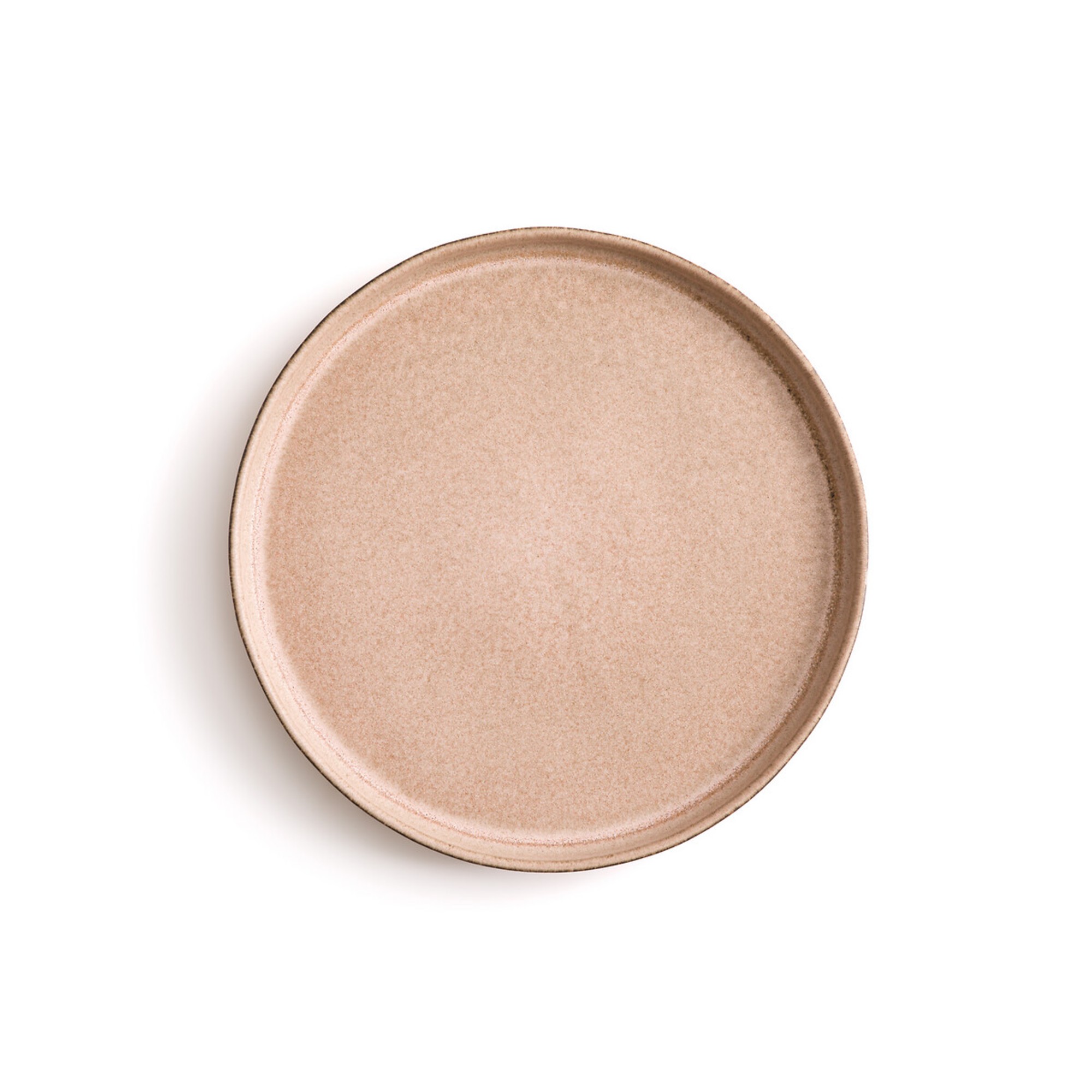

La Redoute
Gandra Stoneware Dessert Plates, Set of 4
If you’re so enchanted with this new shade that you want to spread it to your dining table too, the colour of this set of dessert plates by La Redoute is pretty much identical. Dinner plates are available too.
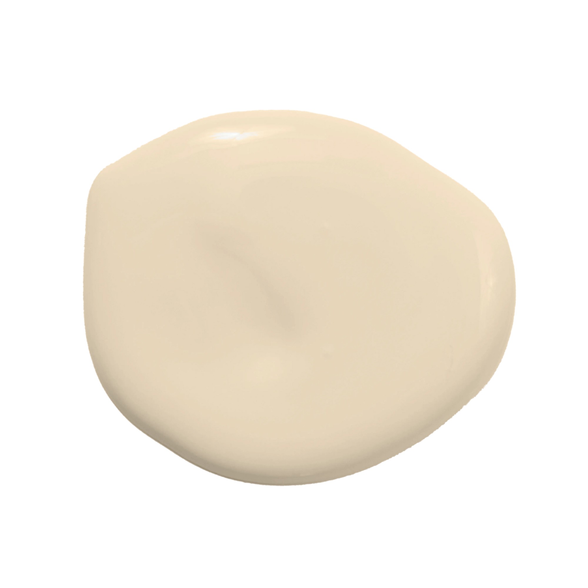
COAT
Cheap Soufflé Flat Matt Paint 1L
Rather than butter yellow, this shade is called ‘cream yellow’. And I think this description fits this soft, creamy shade perfectly. Perfect for those that want a touch of warmth without going too yellow.
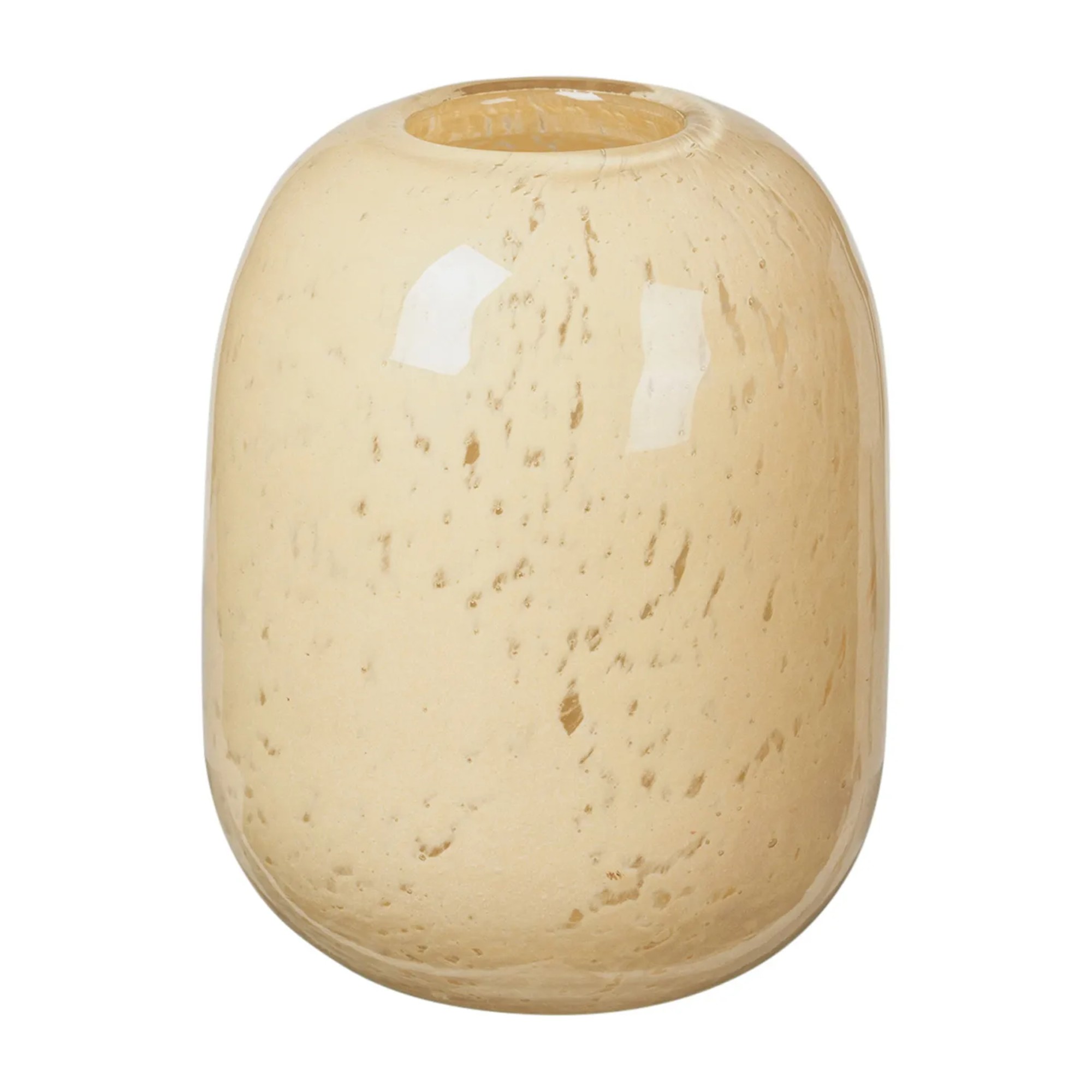
Broste Copenhagen
Kai Vase 10cm
Butter yellow is the biggest colour trend of the season, if not the year. And if you’re not ready for full-on butter yellow walls then smaller accessories like this vase make for the ideal alternative.
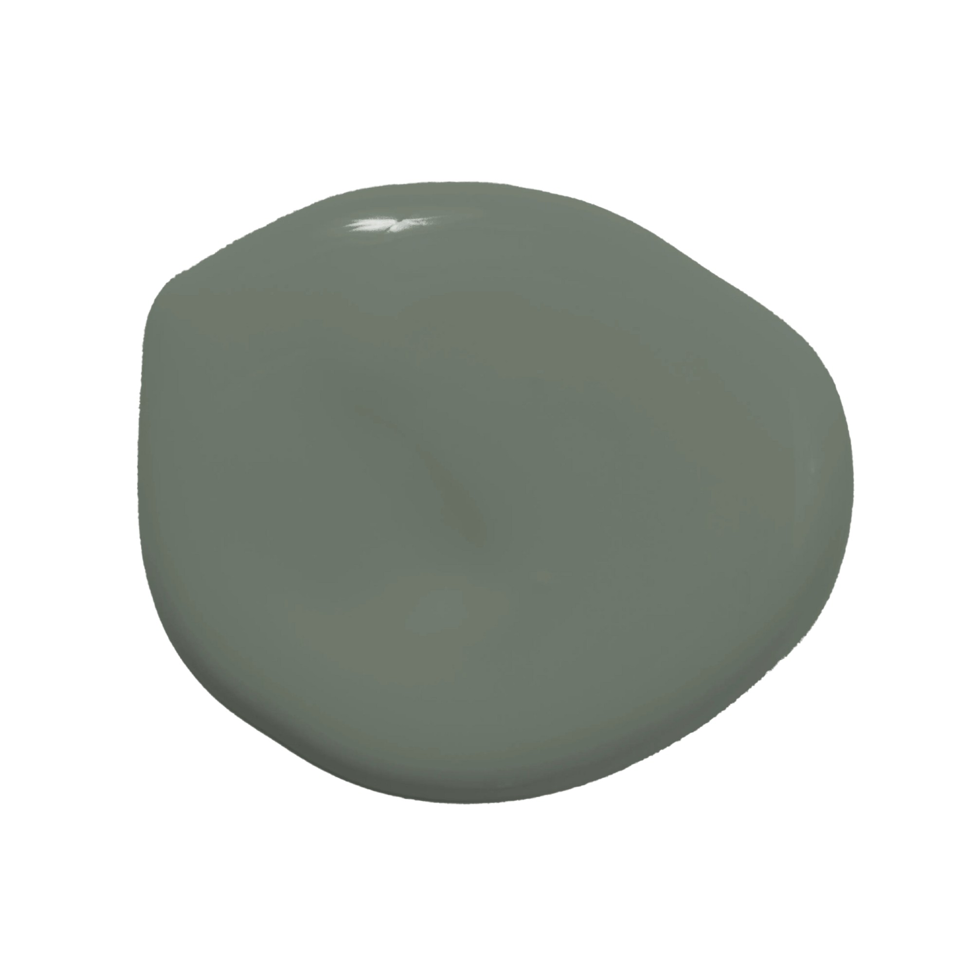
COAT
Retrograde Flat Matt Paint 1L
You can’t go wrong with green, connecting your home with the great outdoors through no more than a colour. And this deep green shade with a grey undertone is predicted to be among the bestsellers.
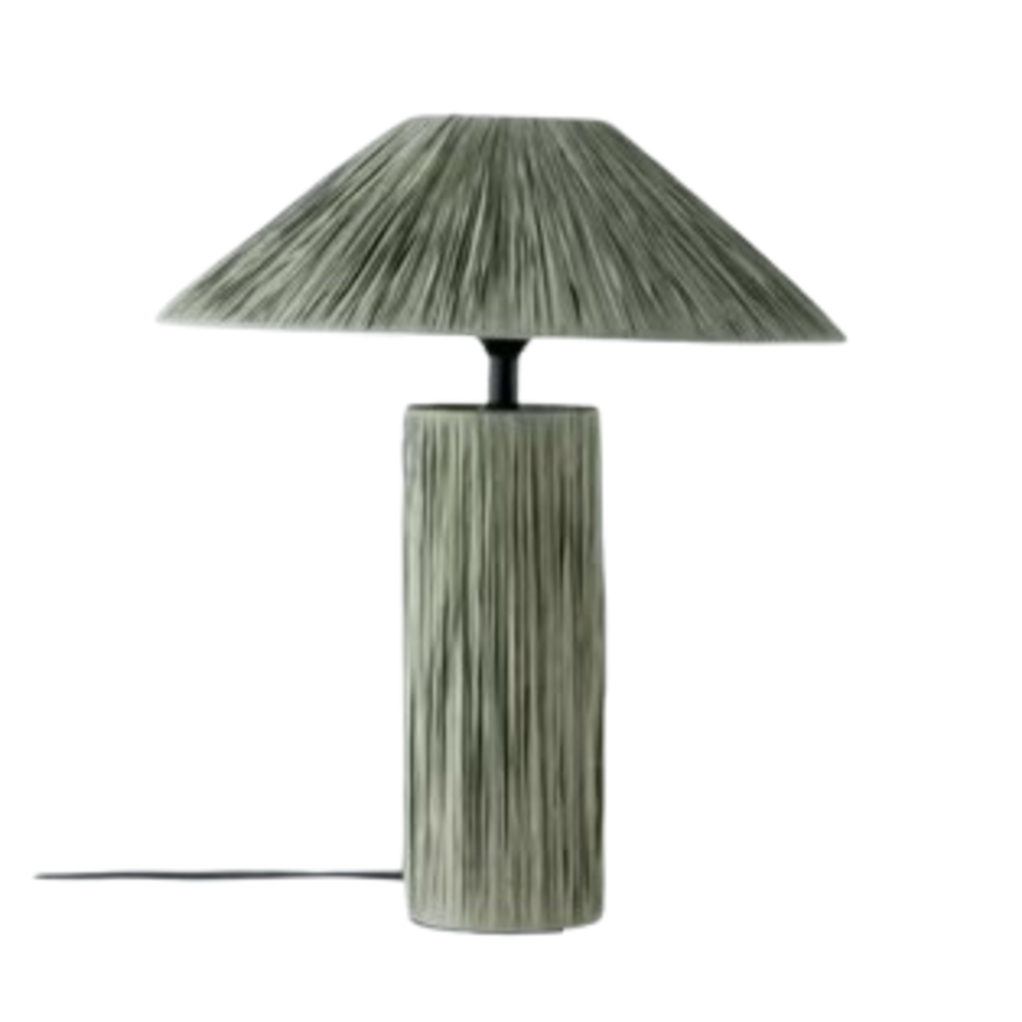
John Lewis
Raffia Table Lamp
I’ve been enjoying the various raffia lamps from John Lewis this year. And this grey-green number is even chicer than the natural-toned styles in my opinion. It also perfectly matches the Retrograde green so you can colour drench down to your room’s accessories.
Which of the new shades are you going to be adding to your home?
Read the full article here


