

If you’re redecorating your home – or even just a single room – and want to switch out the colour scheme of the space, then the colour wheel is an invaluable tool that will turn you into a colour expert, as long as you know how to use it. Which is where this easy guide to how to use the colour wheel like a pro comes in.
As most of us know, some colours go together better than others – while some complement one another, others clash and create an eye sore instead of harmony. Based on looking at the colour wheel and where various colours are placed on it, you could tell what the best colour combinations are and which ones to steer clear of.
‘The colour wheel is a great way of figuring out a colour scheme for a room,’ says Caroline Woolmer, head of design at Lucie Annabel. ‘It helps you understand colours that might work well or clash in your space in a very visual way by highlighting complementary colours.’
What is the colour wheel?
We’ve established the colour wheel is important, but what exactly is it? We like to think of it as a map for colour. It’s basically a visual representation of where colours sit on the spectrum and the relationship between them all.
The wheel that’s used by today’s interior designers actually derives from Sir Isaac Newton’s first circular illustration for colour in 1666. It’s made up of 12 hues, half of which are warm colours (reds, oranges and yellows) and the other half cool colours (lilacs, blues and greens).
‘A colour is a mix of pigment that can be adapted by the level of saturation of that pigment, as well as be affected by external factors such as light and shadow. The essence of the colour wheel is to take the original three primary colours of red, yellow and blue, and then show the secondary and tertiary colours that can be derived from combining and blending them together,’ advises Ruth Mottershead, creative director at Little Greene.
How to use the colour wheel?
‘It’s such a useful bit of kit when it comes to working out what to do with a room,’ says Marianne Shillingford, creative director and colour expert at Dulux. ‘The best way to use one is to find the colour on the wheel that matches the most colourful element you have in the room – for example a blue rug or picture. Your colour wheel may well not have the exact match but near enough will do. What it will show you are colour scheming options to explore.’
And those options are harmonious colours, contrasting colours, tonal colours, split-complementary colours or triadic colours. Here’s what they all mean and how to use them in your living room or bedroom colour scheme.
What are harmonious colours?
Harmonious colours (also known as analogue colours) sit next to each other on the colour wheel. They are the most widely used in interior design, and it’s easy to see why. The name ‘harmonious’ says it all. Choosing adjacent colours is a simple way of creating a harmonious scheme that’s easy to live with.
‘Analogous colour schemes sound intimidatingly technical; however, they are simply colours which are together on the colour wheel,’ says Emma Bestley, co-founder and creative director, YesColours. ‘You just take a small slice out of the wheel, usually 3-4 colours. Think of it as colour “neighbours”, such as reds, oranges and yellows, or blues, violets and purples. They are a harmonious group of colours which sit together extremely well. In the natural world, you just have to look at a sunset and enjoy the red seeping into the orange and yellow peachy hues. Or, a peacock with its incredible indigo, teal and green feathers. It’s naturally pleasing to the eye.’
Marianne at Dulux adds that these are the shades you might use for a double drenching scheme, ‘These are colours that sit either side of your starting colour. With blue, on one side you will have a teal colour and the other a warm blue with hints of violet. They are similar but not the same and you can use both lighter and darker versions of them to decorate any element of the room for a more subtly interesting and harmonious look. I love these shades for double drenched effects in spaces that you want to feel cosy and glamorous, and they are perfect for showing you what coloured accessories would look perfect in the space.’
Example:
John Lewis
Border Large 3 Seater Sofa in Olive Linen
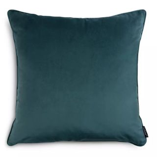
Habitat
Velvet Plain Cushion in Teal
What are contrasting colours?
Contrasting colours are those that sit directly opposite each other on the colour wheel. They are also sometimes referred to as complementary colours. If it’s drama you’re after, a contrasting colour scheme is the one for you. Examples include red and green, yellow and purple and blue and orange.
‘As a simple rule, colours that are opposite each other on the wheel create high contrast and visual excitement,’ says Kathryn Lloyd, Crown colour specialist. ‘Combining hues that sit on opposite sides of the wheel can allow you to create a dynamic and high-energy space, ideal for sociable rooms such as the dining room. Complementary schemes work best when a main shade is used on the walls and ceilings, and its contrasting colour incorporated subtly, such as in artwork or soft furnishings.’
It’s worth bearing in mind that while the colour wheel is a useful tool for identifying contrasting colours, we still need to be a little mindful of how we go about using them within our homes.
‘A complementary palette makes colours appear brighter, making it a great option if you’re after a vibrant and bold interior. However, if you’re after a more understated take on the scheme, it’s a good idea to offset contrasting colours with neutral shades to avoid it becoming too overpowering’, says Katie Thomas, founder of KTM Design
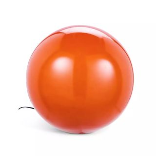
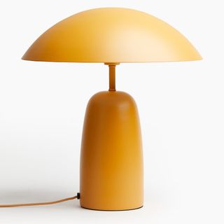
Example:
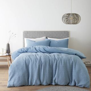
Dunelm
Amberley Waffle Cotton Duvet Cover and Pillowcase Set in Ashley Blue
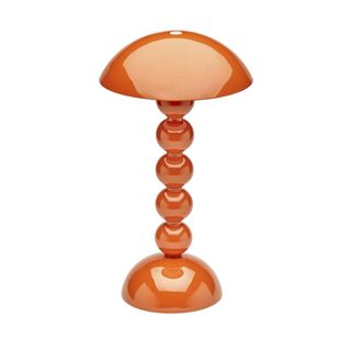
Addison Ross
Bobbin LED Wireless Lamp in Orange
What are split-complementary colours?
Split-complementary colours are where this gets a little more complicated. That’s why we asked paint expert, Francesca Wezel, founder of Francesca’s Paints, on her take on using this colour wheel option.
‘Split-complementary colours are a variation of the complementary colour scheme. In this scheme, instead of using a single colour’s exact complement, you choose the two colours adjacent to its complement on the colour wheel.
For example, if you have a base colour like blue, the split-complementary colours would be yellow-orange and red-orange. A split-complementary scheme creates a visually appealing contrast while offering more variety than a simple complementary pairing.’
Example:
Habitat
Caliban XL Globe Glass Lamp in Orange
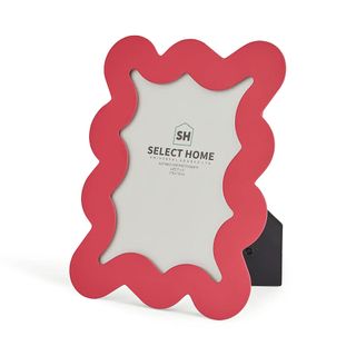
Dunelm
Elements Wiggle Magenta Photo Frame
What are tonal colours?
‘You can also use a colour wheel to create a tonal scheme, using different tints and shades of a single hue,’ Kathryn at Crown Paints says.
Tonal colours are different shades of one colour. A tonal scheme, also sometimes referred to as a monochromatic scheme is arguably the simplest of the colour recipes you can use for decorating. Not to be confused with monochrome meaning black and white, monochromatic schemes includes only different tones (lighter and darker) of the same colour. Start here if you’re unsure about contrasting combinations.
Decorating with tonal colours will most likely result in a fairly uniform scheme. However, there are easy ways to add extra dimension to the room. Using light and dark variations of your chosen colour is the most obvious way. Vary textures to differentiate the colours and make them look more interesting. Then add pops of natural colour with materials like timber and stone – and plants, too.
Example:
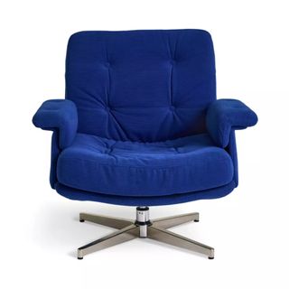
Habitat
Dawson Fabric Swivel Chair in Blue
Habitat
Anala Round Side Table in Blue
What are triadic colours?
Similarly to a split-complementary colour scheme, triadic colours also involve three shades instead of two, as the name suggests. And it involves three colours that are placed on the colour wheel in a way that it creates the shape of a triangle.
‘A triadic colour scheme uses three colours that are evenly spaced around the colour wheel like a triangle – for example, blue, red, and yellow or green, orange, and violet,’ says Jen Devaney, Frenchic Paint’s colour consultant. ‘These palettes naturally create a sense of balance, vibrancy, and energy because each colour holds its own without overpowering the others.’
She continues, ‘In interiors, the key to using triadic harmony well is to avoid using all three colours in equal amounts. Instead, choose one dominant colour to ground the space – this could be your wall colour, upholstery or flooring. Use the second colour as a strong accent, for example cushions, feature chairs or artwork. And the third as a subtle detail – a stripe in a fabric, a vase or even just a thread that runs through your accessories. Triadic schemes work well in spaces where you want visual interest without chaos – like living rooms, dining spaces or creative studios.’
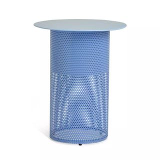
Example:
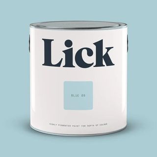
Lick
Blue 08 Matt Paint 2.5L
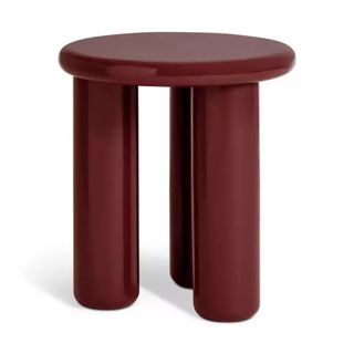
Habitat
Totley Round Side Table in Red
FAQs
What’s the difference between hue, tint and shade?
In order to fully understand how to use the colour wheel, it’s important to familiarise yourself with the language – and get it right. These three words are most often used when discussing colour. However, they’re most often confused, too. Despite being used interchangeably, they mean three very different things.
- Hue: Forming the outer edges of the colour wheel, the primaries, secondaries and tertiaries, a hue is a colour in its purest form. As you can imagine, they’re pretty bold, which is why they’re usually lightened or darkened for most decorating schemes.
- Shade: A shade is created by adding black to a colour to darken it, making it deeper and richer.
- Tint: A tint is created by adding white, making the colour less intense.
What is colour psychology?
Learning how to use the colour wheel is part of a wider understanding of colour, also known as colour psychology. While the wheel is a tool used to determine colours that complement each other visually within a room, colour theory encompasses how these chosen colours may reflect – and affect – mood, feelings and emotions, too. By understanding the basics, you can create a room that not’s not only perfectly balanced, but truly reflects your personality.
So surrounding ourselves with colours that we like is guaranteed to make us feel good? Not always. While our colour preferences play a huge part in how we decorate our homes, colour psychology suggests we should be factoring in the nature of the room we’re decorating – what we do in it, how we want to feel in it, etc – and choose colours accordingly.
Colour psychologist Lee Chambers advises against using red in a living room. ‘Although red promotes energy and socialising, the vibrance can quickly become overwhelming, irritating and ultimately stop you from finding that restful rhythm after a long day,’ he says.
Now with all that knowledge, you can take on creating the most spectacular colour schemes for your home like a pro!
Read the full article here