


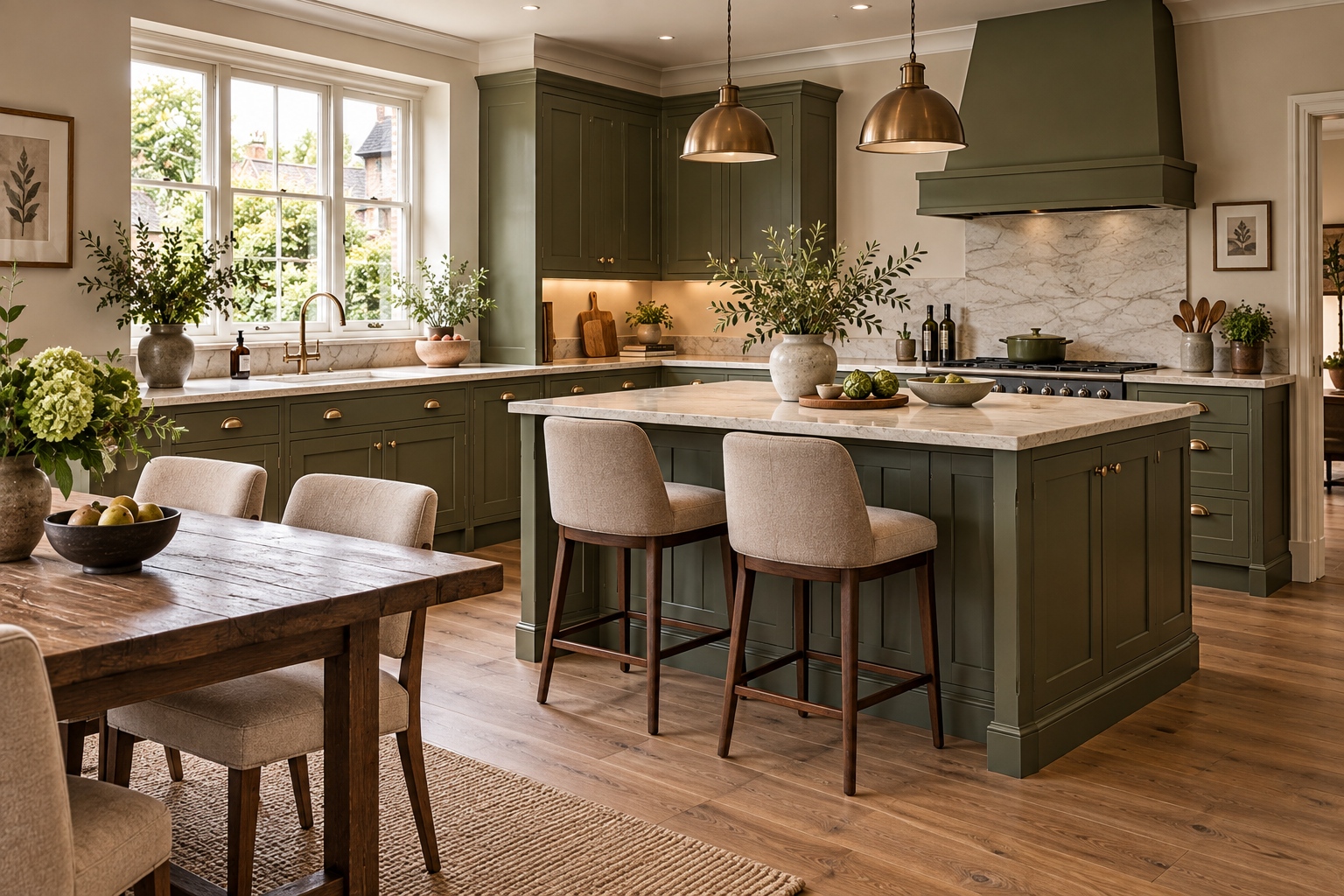
Interior colour trends rarely change overnight. Instead, one shade gradually becomes warmer, another gets muddier, and colours that once seemed daring start appearing so frequently that they begin to feel almost like neutrals. That’s very much the story emerging for 2027.
Some of the first official 2027 Colour of the Year announcements are now here, and there are clear connections between them. We’re seeing earthy pinks, natural greens and softened blues, alongside forecasts filled with oxblood, red-brown, clay and warm neutral shades.
Graham & Brown has selected the earthy pink Rose Earth as its Colour of the Year 2027, while Behr has chosen mossy olive Grounded and Valspar has gone for muted blue Cottage Door
Meanwhile, Sherwin-Williams’ much broader 48-colour Rewild forecast stretches from mossy greens and mineral shades to rich reds, brown and earthy neutrals.
Taken together, they point towards interiors that feel warmer, more natural and increasingly confident about colour. Rather than completely separate trends, many of the most interesting colours for 2027 belong to one beautifully complementary palette.
Here are five of the key colour directions worth watching.
Quick Answer: What Colours Will Be Popular in 2027?
The key interior colour trends emerging for 2027 include earthy pink, olive and moss green, softened blue, burgundy and red-brown, and warm neutrals such as mushroom, cream, taupe and clay.
Many have muted, mineral, brown or earthy undertones, making them surprisingly easy to use. Instead of bright colours sitting against a neutral background, colour itself is increasingly being treated as a neutral.
Why Are Interior Colours Changing in 2027?
For a long time, the default formula for a contemporary home was relatively simple: white, grey or beige walls provided a neutral backdrop, while colour was introduced through furniture and accessories. That distinction is becoming much less obvious.
Olive green can now be used throughout a room without necessarily feeling like a bold colour choice. The same applies to muted blue, clay pink and some red-browns.
There’s also a noticeable move towards colours that have some complexity. Rather than pristine shades, many of the emerging colours look as though they’ve had a little brown, grey, clay or earth mixed into them.
It’s something Sherwin-Williams explores in its extensive 2027 Rewild forecast. Rather than dividing its 48 colours into rigid palettes, it has created three design stories – Revive, Reignite and Reconnect – built around ideas including craftsmanship, individuality, nostalgia and our relationship with the natural world.
Interestingly, the company has also identified ten Continuity Colors that it believes have particular staying power. These include Cordovan, Red Barn, White Duck, Celery, Dutch Tile Blue, Roycroft Bronze Green and Clove – another interesting mixture of green, blue, red, brown and warm neutral.
That makes 2027 colour feel less about finding the fashionable shade and more about creating combinations that are individual, comfortable and easy to live with.
1. Earthy Pink

Forget sugary pink. The version to watch for 2027 is considerably earthier.
Think:
- dusty rose
- plaster pink
- clay pink
- muted salmon
- terracotta pink
- brownish rose
One of the clearest indicators comes from British interiors brand Graham & Brown, which has selected Rose Earth as its Colour of the Year 2027.
Inspired by mineral pigments traditionally obtained from Italian clay deposits, Rose Earth combines pink with clay and muted brown undertones. Graham & Brown describes it as an earthy shade that can be partnered with warm neutrals as well as cooler colours. It’s a good illustration of where pink is heading.
Pink Is Becoming a Neutral
Earthy pink occupies an interesting middle ground. There’s enough colour to make a room feel warm and distinctive, but the brown and clay undertones prevent it from becoming overly sweet. It can consequently perform much the same job as beige, taupe or plaster.
The effect changes according to the light, too. Graham & Brown says Rose Earth reveals dusty rose tones in bright natural light, while warmer taupe and terracotta notes become more apparent as the light decreases. That’s exactly the kind of complexity we’re likely to see more of in 2027.
Where Does Earthy Pink Work?
It’s particularly effective in bedrooms and living rooms, where its warmth can create a cocooning atmosphere, but don’t discount it for kitchens, hallways or bathrooms.
Pink kitchen cabinetry against natural stone could look surprisingly sophisticated, while a clay-pink hallway provides a much warmer welcome than conventional grey.
Try pairing earthy pink with: olive green, burgundy, cream, walnut, chocolate brown, ochre or softened blue. Dark timber is especially good at preventing pink from feeling too delicate.
2. Olive Green

Green has been important in interiors for several years, but the particular type of green we’re choosing continues to evolve.
Pale sage isn’t disappearing – indeed, Dulux has selected the light, silvery Soulful Sage as its Colour of the Year 2027 – but alongside it we’re seeing deeper, muddier greens move into the spotlight.
Think: sage → moss → olive → brown-green.
Behr provides particularly strong evidence for this direction. Its 2027 Colour of the Year, Grounded T27-01, is an earthy olive sitting somewhere between moss and olive, with subtle brown undertones.
Sherwin-Williams is also backing natural greens. Its 2027 Continuity Colors include Celery and the much deeper Roycroft Bronze Green, while the company identifies deep moss, lichen and other colours associated with nature among those with the potential to endure beyond a short-lived trend.
Together, these forecasts suggest that green isn’t so much changing direction in 2027 as expanding its range. Soft sage remains relevant, but richer olive, moss and brown-green shades offer a warmer, more enveloping alternative.
Why Olive Is Such an Easy Colour to Live With
Olive has a quality that many brighter greens lack: it doesn’t demand attention. Its yellow and brown undertones make it feel warm, while its obvious connection with nature allows it to sit comfortably beside timber, stone, linen, wool and other natural materials. It’s therefore capable of acting almost like a neutral.
An olive-painted kitchen, for example, can be colourful without feeling remotely flamboyant. Add warm white walls, oak or walnut, aged brass and a natural stone worktop and it becomes an extremely liveable combination.
Olive can also work beautifully across an entire room, particularly in a snug, study, dining room or bedroom. If you like the idea of taking one shade across several surfaces, our guide to colour drenching explains how to use the technique without overwhelming a room.
What Colours Go With Olive?
One of olive’s biggest advantages is the number of 2027 colours it complements.
Try:
Olive + earthy pink for something soft and natural.
Olive + burgundy for a rich heritage-inspired combination.
Olive + cream for a calmer contemporary scheme.
Olive + terracotta for warmth.
Olive + muted blue for a slightly unexpected but beautifully balanced palette.
3. Softened Blue

Blue hasn’t gone anywhere. What’s changing is its character.
Instead of chilly blue-grey, navy or saturated cobalt, one strand of the 2027 blue story is quieter and more weathered. Think faded denim, mineral blue, smoky blue and the slightly chalky colour of an old painted door.
Valspar’s choice for 2027 captures this particularly well. Its Cottage Door is a greyed mid-tone blue designed to feel warm and familiar rather than crisp or coastal. Valspar describes it as a shade that combines warmth and quiet sophistication, while its suggested coordinating colours include Warm Oatmeal. It’s another example of colour moving into neutral territory.
Why Soft Blue Works With the Warmer 2027 Palette
Blue also serves an important role in the broader palette. If everything becomes brown, beige, terracotta, burgundy and olive, interiors risk feeling heavy. A softened blue provides contrast without introducing a completely unrelated colour.
This is where some particularly beautiful combinations emerge. Try dusty blue walls with a burgundy sofa, for example, or muted blue cabinetry against a warm stone worktop.
Valspar’s Cottage Door also demonstrates how well these blues can work with natural timber. The shade has been shown alongside both lighter woods and deeper walnut and espresso tones.
For British homes, softened blue is particularly useful in bedrooms, kitchens and bathrooms, but it can work equally well in a living room when warmed with timber, patterned textiles and warmer accent colours.
Pair it with: burgundy, walnut, olive, earthy pink, cream, rust or chocolate brown.
4. Burgundy and Red-Brown

Burgundy has already been gathering momentum, and 2027 looks likely to push dark red into even earthier territory.
Rather than one specific red, we’re seeing a family of shades emerging:
- burgundy
- oxblood
- brick
- mahogany
- cordovan
- dark cherry
- rust
- brown-red
Sherwin-Williams’ 2027 forecast contains rich red and earthy shades, with Cordovan and Red Barn both included among its ten Continuity Colors. Its broader Rewild collection has been characterised by colours ranging from moody oxblood and moss green to sun-baked clay.
Graham & Brown’s wider 2027 paint collection tells a similar story. Alongside Rose Earth and deep greens, its new colours include warm neutrals such as Pebble and Toasted Almond and bold red-browns including Cowboy Hat and Chilli Cocoa. That’s quite a compelling collection of evidence for the red-brown direction.
Why Red Is Becoming Browner
A brown undertone immediately changes how red behaves in a room. Clear red is energetic and attention-grabbing. Brown-red feels earthier, deeper and often much easier to combine with existing furniture. It also fits beautifully with the revival of darker timber.
Walnut, mahogany and dark oak can look particularly striking against burgundy, oxblood and brick red because the colours share some of the same warmth.
How to Decorate With Burgundy and Red-Brown
You don’t have to colour drench a room in oxblood to embrace the trend. Try a burgundy armchair against soft blue walls, paint kitchen cabinetry in a muted red-brown, or introduce the colour through curtains, rugs or upholstery.
If you do want drama, however, burgundy is excellent for dining rooms, snugs and smaller rooms where depth of colour can become an asset rather than something to fear.
Some of the best combinations are:
Burgundy + dusty blue
Burgundy + olive
Burgundy + earthy pink
Burgundy + warm cream
Burgundy + walnut
If you’ve already fallen for this colour, take a look at our guide to What Colours Go With Burgundy?, where we explore 15 different combinations in more detail.
5. Warm Neutrals

If all this talk of colour has you wondering what happened to beige, don’t worry. Neutrals certainly aren’t disappearing in 2027. They’re simply getting warmer and more interesting.
Look towards:
- mushroom
- oatmeal
- warm stone
- putty
- taupe
- camel
- sand
- cream
- clay-beige
- soft brown
Perhaps most importantly, neutrals aren’t necessarily being asked to carry an entire interior by themselves. Instead of a room containing cream walls, a cream sofa, a beige carpet and oatmeal curtains, the neutral can provide a foundation for one or two of the earthier colours emerging alongside it.
Warm neutrals are also particularly useful in rooms where the natural light can make cooler shades feel flat or chilly. If this is something you struggle with at home, our guide to the best colours for a north-facing sitting room has more ideas for using cream, mushroom, taupe and other warmer shades successfully.
That might mean:
mushroom walls + burgundy armchair + walnut furniture
or
warm cream + olive + terracotta
or
taupe + dusty blue + dark timber.
The official forecasts provide plenty of evidence for this warmer approach. Graham & Brown’s 2027 collection contains shades including Pebble and Toasted Almond, while Valspar recommends Warm Oatmeal alongside its blue Cottage Door. Sherwin-Williams’ Continuity Colors include White Duck and Clove alongside its greens, reds and blues.
Even Dutch Boy’s Colour of the Year points in a similar earthy direction. Deep Rooted 311-7DB is an earthy orange designed around natural warmth rather than a cool neutral aesthetic.
The 2027 Colour Palette: Why These Shades Work Together

Perhaps the most interesting thing about the 2027 forecasts isn’t any individual colour. It’s how well the colours work together.
Consider this palette:
Earthy pink | Olive | Soft blue | Burgundy | Mushroom | Warm cream
On paper, that’s quite a lot of colour. But in practice, it can be remarkably calm.
The reason is undertone. These aren’t clean primary or secondary colours. They’re softened by brown, grey, clay, mineral and earthy undertones. That’s what allows dusty pink to sit comfortably beside olive, or faded blue beside burgundy.
It’s also consistent with Sherwin-Williams’ decision not to prescribe fixed combinations for its Rewild forecast. The company has deliberately created 48 colours intended to be mixed, layered and interpreted individually rather than organised into strict palettes.
Three 2027 Colour Schemes to Try
Soft and Natural
Earthy pink + olive + warm cream.
This would work beautifully in a bedroom or living room. Try pink walls, an olive upholstered chair and cream curtains, with walnut or oak adding another layer of warmth.
Rich and Sophisticated
Burgundy + mushroom + softened blue.
Let mushroom provide the quiet backdrop, use burgundy on a sofa or substantial piece of furniture and introduce blue through curtains, cabinetry or painted woodwork.
Modern Earthy
Olive + red-brown + clay + cream.
This combination works particularly well with tactile materials such as timber, terracotta, stone, linen and wool.
How to Use 2027 Colour Trends Without Redecorating Your Whole Home

There’s no reason to repaint your house every time a new colour forecast arrives. In fact, the best way to approach colour trends is to treat them as inspiration rather than instructions.
If you already have a relatively neutral room, introduce one of these shades through a rug, curtains, cushions, artwork or an occasional chair.
For a slightly bigger change, paint a piece of furniture, alcove, shelving or fitted cabinetry. And if you’ve discovered a colour you genuinely love, then consider the walls.
One advantage of the 2027 palette is that many of these shades are surprisingly forgiving. Olive, warm blue and clay pink aren’t colours that immediately announce the year in which a room was decorated. That matters if you’re investing in something expensive such as kitchen cabinetry, tiles or upholstery.
Which 2027 Colours Have the Most Staying Power?

Interior colour forecasting is never an exact science, and no-one can guarantee that today’s fashionable colour will still dominate interiors five years from now. However, some colours are easier to imagine enduring than others.
Olive green is arguably one of the safest bets. Its connection with nature, compatibility with timber and ability to behave like a neutral give it considerably more longevity than many fashion-led colours.
Softened blue has similar advantages. Blue itself is hardly a new decorating colour; what’s changing is the particular tone.
Warm neutrals are also likely to endure, although individual shades will continue to shift between lighter, darker, pinker and browner interpretations.
Burgundy and red-brown are more distinctive but have historical precedent on their side. These are colours that can feel equally at home in a period property or contemporary interior.
And earthy pink has much better prospects for longevity than its sweeter predecessors. Once pink contains enough clay, brown or taupe, it begins to behave more like a warm neutral.
Sherwin-Williams’ own reasoning behind its new Continuity Colors is interesting here. Its trend team highlights complexity and an ability to change according to context as important characteristics of longer-lasting colours, particularly shades connected with moss, lichen, minerals, rust and stone. That’s a useful principle to apply even if you never buy a Sherwin-Williams paint.
2027 Interior Colour Trends at a Glance
| 2027 colour trend | Shades to look for | Try pairing with |
|---|---|---|
| Earthy pink | Clay, dusty rose, plaster pink | Olive, burgundy, cream |
| Olive green | Moss, olive, bronze green, deep sage | Pink, cream, red-brown |
| Softened blue | Dusty blue, mineral blue, faded denim | Burgundy, brown, cream |
| Burgundy/red-brown | Oxblood, wine, brick, cordovan, mahogany | Blue, olive, pink |
| Warm neutrals | Mushroom, stone, taupe, oatmeal, cream | All of the above |
What Is the Biggest Colour Trend for 2027?

If we had to identify one overarching interior colour trend, it wouldn’t actually be a single colour. It would be earthiness. Pink is becoming clay-like. Green is moving towards moss and olive. Blue is faded and greyed. Red contains brown. Neutrals resemble mushroom, oatmeal, soil and stone.
Nature is an obvious common thread, but there’s something else happening too. We’re becoming more comfortable with the idea that a home can contain quite a lot of colour without necessarily feeling colourful.
A muted olive wall can provide a background rather than a statement. Earthy pink can replace beige. Dusty blue can perform the role once occupied by grey. Burgundy or red-brown can provide the visual weight traditionally supplied by charcoal or black. And that may ultimately be the most useful lesson to take from the 2027 forecasts.
2027 Is About Colour You Can Live With
Colour forecasting is fun, but a home shouldn’t feel like a time capsule of a particular trend year.
The encouraging thing about the emerging 2027 interior colour trends palette is that it doesn’t have to. Earthy pink, olive, softened blue, burgundy and warm neutrals have enough history and familiarity behind them to work beyond a single season. What’s new is the way they’re being brought together.
We’re moving away from the idea that colourful decorating requires bright walls or dramatic contrasts. Instead, colour can be soft, muddy, faded, mineral, earthy and quietly layered.
The result is a home that can feel warmer, richer and more individual – without necessarily becoming louder. That feels like a particularly liveable direction for 2027.
–> For more inspiration about using colour in your home, check out our dedicated Colour section.
0
Related
Read the full article here