


It’s easy to think of primary colours as something best left to playrooms and nurseries. Bright reds, blues and yellows can feel a bit bold, even overwhelming, when you’re trying to create a calm, grown-up home.
But used in the right way, these colours can completely transform a space. They bring energy, warmth and personality, and can make a room feel more inviting and lived-in. The key is knowing how to use them without tipping into “too much.”
If you’ve ever felt drawn to bold colour but weren’t quite sure how to make it work, this is where primary colours can surprise you.
What are primary colours?
In simple terms, the three primary colours are red, blue and yellow. They can’t be created by mixing other colours, and they form the base for almost every other shade in the colour spectrum.
In interior design, though, the term is often used a little more loosely. When people talk about “primary colour schemes,” they’re usually referring to bold, saturated shades inspired by these colours. That might include strong greens, oranges or purples alongside the traditional trio.
What matters most isn’t strict colour theory, but how these shades feel in a space and how they work together in your home.
Colours and emotion
Primary colours, more than the rest of the colour palette, are associated with distinct emotions.
Red, the boldest of all shades, is associated with romance, energy and warmth. It’s a good choice for social spaces, such as living areas, but would be too energising for a bedroom.
Blue, one of the most popular interior design choices, is associated with calmness and nature. It’s a good choice for bedrooms, but can make rooms feel cold if there’s not enough natural light or you choose too strong a shade.
Yellow is the most cheerful of colours. It’s associated with sunlight, happiness and optimism. It’s a great choice for kitchens, hallways or any room that’s naturally a bit on the dark side and needs cheering up.
Why Primary Colours Work in Interiors


Primary colours have a clarity and confidence that softer shades sometimes lack. They stand out, they catch the eye, and they instantly bring life into a room.
That doesn’t mean you need to decorate an entire space in bold colour. In fact, the opposite is usually more effective. When used in small, thoughtful ways, primary colours can:
- Lift a neutral room and stop it feeling flat
- Add warmth and personality
- Create focal points without clutter
- Make a space feel more “you”
It’s less about going all in, and more about using colour with intention.
The Emotional Impact of Each Colour
Colour isn’t just visual, it shapes how a room feels. Primary colours tend to have strong emotional associations, which is why they can be so effective when used well.
Red: Warmth, Energy and Connection
Red is the boldest of the three. It’s associated with warmth, energy and even a sense of comfort when used in the right way.
It works particularly well in social spaces like living rooms or dining areas, where you want a sense of activity and connection. That said, it’s easy to overdo. Too much red can feel intense, so it’s often best used in smaller doses, such as cushions, artwork or a statement chair.
Blue: Calm, Balance and Quiet
Blue is one of the most popular choices in interior design for good reason. It brings a sense of calm and works beautifully in bedrooms and bathrooms.
However, blue can sometimes feel a little cold, especially in north-facing rooms or spaces with limited natural light. Pairing it with warm materials like wood, brass or soft textiles helps keep the room feeling balanced.
Yellow: Light, Optimism and Warmth
Yellow is naturally uplifting. It reflects light well and can brighten even the darkest corners of a home.
It’s a great choice for kitchens, hallways or any space that needs a lift. Softer shades like buttermilk or pale ochre work well on larger surfaces, while brighter tones can be used for accents to add a cheerful touch without overwhelming the space.
How to Use Primary Colours Without Overdoing It


This is where most people get stuck. It’s not that they don’t like bold colour, it’s that they’re worried about getting it wrong.
The simplest approach is to start small and build confidence as you go.
Use Accent Pieces First
One of the easiest ways to introduce primary colours is through accessories. Think cushions, throws, vases, lampshades or artwork.
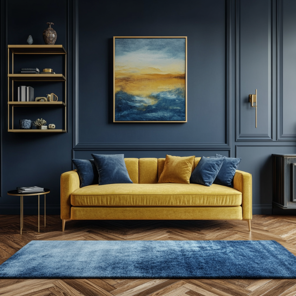
A bright yellow armchair or a set of deep blue cushions in an otherwise neutral room can create impact without feeling overpowering. It also gives you flexibility. If your taste changes, it’s easy to swap things out.
Let Neutrals Do the Grounding
Primary colours work best when they have something to balance against. Whites, greys, beiges and natural materials like wood help anchor bold shades and stop them from taking over the room.
This contrast is what makes colour feel intentional rather than chaotic.
Repeat Colours for a Cohesive Look
A single bright item can sometimes feel out of place. Repeating the same colour in a few small ways around the room helps tie everything together.
For example, a blue vase, a piece of artwork and a patterned cushion can quietly echo each other without being too obvious.
Try Colour Blocking
If you’re feeling a bit more confident, colour blocking is a great way to use primary shades in a more deliberate way.
This might mean pairing blocks of blue and yellow, or red and blue, within the same space. It adds depth and interest, and stops one colour from dominating. The key is to keep the rest of the room relatively simple so the colours can stand out.
Easy Ways to Introduce Primary Colours at Home
If you’re not sure where to begin, these ideas are a good place to start:
- Add colourful cushions or throws to a neutral sofa
- Introduce bold artwork featuring red, blue or yellow tones
- Paint a small piece of furniture, like a side table or cabinet
- Use statement lighting, such as a bright lampshade
- Style shelves with colourful books and accessories
If you want to go a little further, you could try a feature wall or a painted alcove, but it’s always worth testing a shade first to see how it feels in your space.
Simple Colour Combinations That Work

If mixing colours feels daunting, start with combinations that are known to work well:
- Blue and yellow: fresh, uplifting and balanced
- Red and blue: bold but grounded
- Yellow and red: warm and energetic, best used in moderation
Sticking to two main colours, rather than all three at once, often creates a more cohesive look.
A Simple Approach to Getting It Right
If you like the idea of using primary colours but want to keep things simple, this approach works well:
- Choose one main colour
- Add one supporting colour
- Use neutrals to balance the space
- Repeat colours in small details
- Build slowly rather than doing everything at once
This way, your home evolves naturally rather than feeling forced.
Final Thoughts
Primary colours don’t have to feel childish or overwhelming. When used thoughtfully, they can bring warmth, personality and a sense of energy into your home in a way that softer palettes sometimes can’t.
The key is to use them in a way that feels comfortable to you. Start small, trust your instincts, and don’t feel pressure to get everything perfect. A home that feels lived-in and personal will always be more inviting than one that plays it too safe.
Primary Colour Product Ideas


0
Related
Read the full article here


