






Rich, warm and wonderfully sophisticated, burgundy is a colour that can completely transform a room. It has much of the drama of red, but its deeper wine, berry and brown undertones make it easier to live with and surprisingly versatile.
Burgundy can feel luxurious and cocooning when teamed with other deep shades, fresh and contemporary alongside pale colours, or earthy and relaxed when combined with natural greens and warm neutrals. It works beautifully on walls and kitchen cabinetry, but is equally effective on a velvet sofa, upholstered headboard, curtains or smaller accessories.
The trick is choosing colours that bring out the best in burgundy rather than competing with it.
Why Is Burgundy So Popular in Interiors Right Now?
If burgundy seems to be appearing everywhere at the moment, it’s not your imagination. After several years dominated by pale neutrals, greens and relatively restrained colour palettes, interiors have been moving towards warmer, richer and more characterful shades.
There’s data behind the shift, too. Research by 1stDibs found that 21% of designers surveyed for its 2026 trends report said they planned to use burgundy, three times the 7% recorded in 2022. Pinterest data points in the same direction too. Their 2026 colour research found searches for “deep burgundy” had risen by 230%. Pinterest says its annual palette is based on analysis of billions of searches and saves from its 600 million users, so it’s a useful indicator of the colours people are actively looking for and saving as inspiration.
The wider interiors industry has been noticing the same change. House & Garden highlighted burgundy and merlot among its paint colours to watch, predicting a move towards deeper wine-red shades that add atmosphere rather than the intensity of brighter reds. British Vogue similarly identified wine red as a significant interiors trend as burgundy moved from fashion into the home.
Burgundy also fits into a broader change in how we’re using colour. The dominance of all-white and very pale neutral interiors has been giving way to warmer browns, earthy shades and more saturated colours. Burgundy sits particularly comfortably within this new palette because it feels dramatic without necessarily being bright. Its brown, wine and berry undertones give it a warmth and depth that makes it surprisingly easy to live with.
Unlike some fleeting colour trends, burgundy has history on its side. Wine reds and oxblood shades have long appeared in furniture, textiles, leather, decorative arts and period interiors. So while burgundy is undoubtedly fashionable at the moment, it’s also established enough to have staying power — an important consideration when you’re choosing a colour for something more permanent than a cushion or throw.
Quick Answer: What Colours Go With Burgundy?
Some of the best colours to pair with burgundy are cream, warm white, taupe, beige, sage green, olive green, forest green, navy, dusty blue, pale blue, blush pink, teal, ochre, terracotta and charcoal.
For a light contemporary look, try burgundy with warm white, cream, pale blue or sage. For something richer, combine it with olive, navy, teal or forest green. If you prefer warm, earthy interiors, burgundy works particularly well with terracotta, ochre, walnut and aged brass.
Understanding Burgundy’s Undertones


Before choosing your colour scheme, take a good look at the particular burgundy you’re working with. Burgundy isn’t one single colour.
Some versions are distinctly red and warm, while others have brown, plum, purple or berry undertones. Place two burgundy paint swatches next to each other and the difference can be surprisingly noticeable.
This matters because a warm, brownish burgundy may look fantastic with terracotta and olive, while a cooler berry burgundy could work particularly well with dusty pink or blue.
If you’re choosing paint, always test the burgundy and its companion colours together in the room. Look at them in daylight and artificial light before making a final decision.
1. Cream


Cream is one of the easiest colours to combine with burgundy. It provides enough contrast to lift the darker shade without the sharpness of brilliant white.
Use cream walls around a burgundy sofa, for example, or break up a burgundy-painted room with cream upholstery, curtains and a pale rug.
Cream also works particularly well if you’re aiming for an elegant rather than overtly colourful scheme.
Try this palette: Burgundy walls, cream upholstery, walnut furniture and aged brass lighting.
2. Warm White


If you love burgundy but want your room to feel fresh and contemporary, warm white is an excellent partner.
The important word here is warm. A brilliant blue-toned white can create a rather severe contrast with burgundy, whereas whites with soft cream, stone or red undertones tend to sit much more comfortably alongside it.
Warm white is particularly useful on ceilings and woodwork in rooms with burgundy walls. Alternatively, reverse the combination and introduce burgundy through furniture and accessories against predominantly white surroundings.
Try this palette: Warm white walls, a burgundy velvet sofa, light oak furniture and touches of black.
3. Beige

Burgundy and beige can sound like quite a traditional combination, but it doesn’t have to look dated.
The key is choosing contemporary beige shades such as oatmeal, sand and natural linen rather than anything too yellow. Texture helps too. Think chunky woven rugs, linen curtains, bouclé upholstery and natural stone.
Against these quieter surfaces, burgundy provides a welcome shot of rich colour.
Try this palette: Oatmeal walls, burgundy armchairs, natural linen, pale stone and dark timber accents.
4. Taupe

Somewhere between brown and grey, taupe is a particularly sophisticated companion for burgundy.
It’s deeper than cream or beige, so there is less contrast between the two colours. The result is a softer, more enveloping scheme.
Taupe, mushroom and warm greige shades are also useful if you want to introduce burgundy into an existing neutral interior without completely redecorating.
Try this palette: Taupe walls, burgundy curtains and cushions, cream upholstery and walnut furniture.
5. Blush Pink

Burgundy and pink are natural companions because they sit within the same broad colour family.
Rather than pairing burgundy with a sugary pastel pink, look for muted shades such as dusty rose, plaster pink, old rose and soft clay pink.
The lighter colour takes some of the heaviness out of burgundy, while burgundy prevents pink from feeling overly sweet.
This combination can be particularly effective in bedrooms and living rooms.
Try this palette: Dusty pink walls, a burgundy headboard, cream bedding and antique brass details.
6. Sage Green

If you’re wondering what green goes with burgundy, sage is an excellent place to start.
Green provides a natural contrast to red-based burgundy, but the muted quality of sage keeps the combination restful rather than overpowering.
It’s also an easy palette to incorporate into contemporary homes. You could combine sage cabinetry with burgundy tiles or accessories in a kitchen, or introduce a burgundy sofa into a sage green living room. Lighter sage greens can work too; see our guide to colours that go with sage green for more ideas.
Natural wood and warm white work beautifully alongside both colours.
Try this palette: Sage walls, a burgundy sofa, warm white woodwork, oak furniture and brass lighting.
7. Olive Green

For something richer and earthier, pair burgundy with olive green.
These two colours have considerable depth, but their earthy undertones help them sit comfortably together. Add dark oak or walnut and the result can feel warm, established and sophisticated.
If you’re concerned about the combination becoming too dark, introduce plenty of cream or warm white.
Try this palette: Burgundy walls, an olive green sofa, walnut furniture, cream curtains and an aged brass floor lamp.
8. Forest Green

Burgundy and forest green are not for anyone who wants their interiors to disappear quietly into the background. Used well, however, they’re a fantastic pairing.
Both are rich, saturated colours, so you don’t necessarily need equal amounts of each. Try making one dominant and using the other as a secondary shade.
A forest green sofa against burgundy walls could look spectacular, for example. Alternatively, burgundy upholstery and accessories can add warmth to a predominantly green room.
Introduce lighter flooring, a pale ceiling or cream textiles if you want to prevent the room becoming too enclosed.
Try this palette: Forest green walls, burgundy velvet seating, cream curtains and warm brass accents.
9. Navy Blue

Navy and burgundy are classic partners and can give a room a smart, sophisticated appearance.
Because both colours are dark, proportion is important. Unless you’re deliberately creating a cocooning interior, include lighter elements to provide some relief.
Cream, pale stone, warm white and natural timber can all help.
The combination works particularly well in living rooms, dining rooms, home offices and libraries.
Try this palette: Navy walls, a burgundy armchair, warm oak flooring, cream upholstery and antique brass.
10. Dusty Blue

If navy feels too dark, try burgundy with dusty blue.
A muted blue provides cool contrast against burgundy without competing for attention. It’s a particularly lovely way of making burgundy feel softer and slightly less formal.
Try dusty blue walls with burgundy curtains, or combine blue upholstery with a burgundy-painted feature such as cabinetry or woodwork.
Try this palette: Dusty blue walls, burgundy curtains, warm white woodwork and medium-toned oak.
11. Teal

Burgundy and teal make a much bolder colour statement.
The blue-green tones of teal contrast beautifully with the warmth of burgundy, creating a jewel-like combination that feels luxurious and characterful.
The easiest way to use the pairing is to choose a dominant colour. You might have a teal-painted room with a burgundy sofa, for example, rather than attempting to divide the space equally between the two.
A neutral third colour can give the eye somewhere to rest.
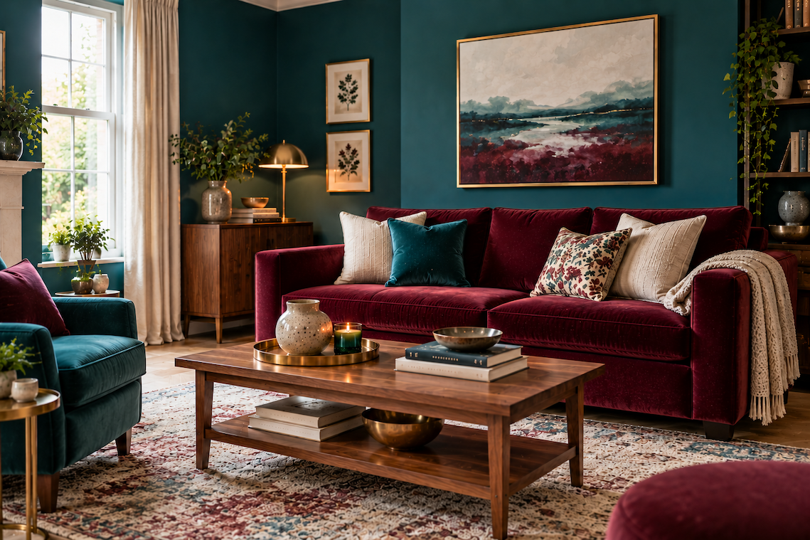
Try this palette: Deep teal walls, a burgundy sofa, warm cream textiles, walnut and brass.
12. Ochre

Burgundy works beautifully with yellow, but a muted ochre is generally easier to live with than a bright primary yellow.
Ochre brings warmth and energy to burgundy and can stop the darker colour feeling too serious.
You don’t need very much of it. An ochre chair, patterned rug, cushions or artwork could be enough to enliven a predominantly burgundy and neutral scheme.
Try this palette: Burgundy, ochre, cream, dark walnut and touches of aged brass.
13. Terracotta

If your burgundy has warm red or brown undertones, terracotta can be a particularly successful partner.
Rather than creating strong contrast, these colours flow into one another, producing an earthy tonal scheme.
Terracotta is also easy to introduce through floor tiles, ceramics, lamps, cushions and rugs if you don’t want another strong paint colour.
Pale plaster pink, cream and warm white can help soften the overall palette.
Try this palette: Burgundy cabinetry, terracotta tiles, warm white walls and natural oak.
14. Charcoal Grey

Charcoal can give burgundy a sharper, more contemporary edge.
The trick is to go deliberately dark rather than choosing an uncertain mid-grey. Some cool grey shades can make burgundy appear muddy, whereas deep charcoal creates a confident contrast.
Black can be used in a similar way, particularly through window frames, furniture, lighting and smaller architectural details.
Try this palette: Burgundy walls, charcoal furniture, pale flooring and warm metallic accents.
15. Pale Blue

Burgundy and pale blue might not be the first combination that springs to mind, but that’s precisely why it can look so interesting.
Soft powder blue, chalky blue and muted sky blue all provide a fresh counterpoint to burgundy’s richness.
It’s an especially useful combination if you already own a large burgundy piece, such as a sofa or bed, and want to make the surrounding room feel lighter.
Warm white and pale oak can bring the whole scheme together.
Try this palette: Pale blue walls, a burgundy sofa, warm white curtains and light oak furniture.
Does Burgundy Go With Grey?
Yes, burgundy can go with grey, but some greys work better than others.
Warm grey, mushroom, taupe-grey and deep charcoal are generally the easiest choices because they complement burgundy’s warmth.
Cool mid-greys can be trickier. Depending on the particular undertones, they can drain some of the richness from burgundy or make a room feel colder than intended.
If you already have grey flooring or furniture, place samples of your chosen burgundy alongside it before committing to a large area.
Does Burgundy Go With Brown?
Burgundy and brown can be an extremely successful combination, particularly when brown comes from natural materials.
Walnut, dark oak, chocolate brown, cognac leather and tan all complement burgundy’s warm undertones.
It’s a particularly useful pairing if you own traditional wooden furniture but want to create a more contemporary colour scheme around it.
The main consideration is overall darkness. If you’re combining burgundy walls with dark timber furniture and flooring, introduce cream, warm white or another pale shade elsewhere.
What Wood Tones Go With Burgundy?

One of the reasons burgundy is so useful in interiors is that it works with many different types of wood.
Pale oak creates contrast and gives burgundy a lighter, more contemporary appearance.
Medium oak emphasises burgundy’s warmth and works particularly well in relaxed living and dining spaces.
Walnut creates a richer, more luxurious combination that’s ideal for living rooms, dining rooms and bedrooms.
Dark wood can look extremely dramatic alongside burgundy, but you’ll usually want some paler surfaces to balance the scheme.
There’s no need to match every piece of wood exactly. A room containing a thoughtful mix of timber tones can look much more natural than one in which everything comes from the same furniture range.
Metal finishes can subtly change the character of a burgundy colour scheme.
Aged and brushed brass emphasise its warmth and create a luxurious look, while antique bronze feels slightly quieter and works particularly well in earthy or traditional-contemporary interiors.
Chrome and nickel provide a cooler contrast and can make burgundy feel more modern. Matt black creates a stronger graphic effect and is useful for lighting, furniture legs, handles and window frames.
You don’t have to stick rigidly to one metal finish either. A considered mix of metals can give a room more depth.
How to Decorate With Burgundy Without Making a Room Too Dark
Burgundy is undeniably a deep colour, but using it doesn’t mean your room has to feel dark.
If you’re hesitant about painting every wall burgundy, consider using it on the lower part of a wall with a lighter shade above, painting cabinetry or built-in storage, or introducing it through one substantial piece of furniture.
A burgundy sofa, headboard or pair of curtains can have almost as much impact as painted walls.
Think about the surfaces around it too. Pale flooring, light rugs, warm white ceilings and reflective materials can all help bounce light around the room.
Natural light matters as well. A bright south-facing room may comfortably accommodate large amounts of burgundy. In a darker north-facing room, you have two choices: balance it with lighter colours or deliberately embrace the darkness and create a cosy, enveloping interior.
Neither approach is inherently right or wrong. The important thing is that it feels intentional.
How Much Burgundy Should You Use?

There’s no rule that says burgundy has to be an accent colour. How much you use should depend on the effect you’re trying to achieve.
Make Burgundy the Dominant Colour
For maximum impact, use burgundy across the walls, cabinetry or even walls and woodwork together.
Supporting colours can then appear through flooring, upholstery, furniture and accessories.
This approach works particularly well if you want a warm, cocooning room.
If you really love burgundy, you could take the idea further with colour drenching, using the shade across walls, woodwork and even fitted cabinetry
Use Burgundy as a Secondary Colour
If you’d rather not commit to burgundy walls, use it on something substantial enough to influence the room.
A burgundy sofa, upholstered bed, curtains, large rug or painted kitchen island can become the starting point for the entire colour palette.
Use Burgundy as an Accent
For a subtler approach, introduce burgundy through cushions, lamps, throws, artwork, ceramics or occasional furniture.
Repeating the colour in several places will make it look intentional rather than as though a single burgundy object has accidentally found its way into the room.
7 Burgundy Colour Palette Ideas


If you like burgundy but aren’t sure how to build a complete room around it, try one of these combinations.
Warm and Sophisticated
Burgundy + cream + walnut + aged brass
A particularly good choice for living rooms and dining rooms. Cream prevents the darker elements becoming too heavy, while walnut and brass reinforce the warmth of burgundy.
Earthy and Contemporary
Burgundy + olive + warm white + oak
Rich without feeling formal. Use warm white generously if you want a brighter interpretation.
Soft and Tonal
Burgundy + dusty pink + taupe + cream
The muted pink creates a gentle tonal link with burgundy, while taupe prevents the palette becoming overly feminine.
Bold and Colourful
Burgundy + teal + ochre + warm white
A confident combination for anyone who loves colour. Use warm white to give the stronger shades room to breathe.
Dark and Dramatic
Burgundy + forest green + charcoal + brass
Ideal for creating a cocooning dining room, snug or living room. Layer in plenty of lamps and warm lighting at night.
Fresh and Modern
Burgundy + pale blue + warm white + light oak
A great example of how burgundy doesn’t have to look dark or traditional. The pale blue and timber considerably lighten its character.
Warm and Earthy
Burgundy + terracotta + plaster pink + cream
A warm tonal palette that works particularly well with tactile fabrics, natural materials and handmade ceramics.
Are There Any Colours That Don’t Go With Burgundy?
There aren’t many colours that categorically cannot be used with burgundy. It’s more a question of choosing the right version of a colour and getting the proportions right.
There are, however, a few combinations that require more care.
Brilliant white can create a very stark contrast. A warmer white or cream is often more flattering.
Cool mid-grey can occasionally make burgundy look muddy or dated. Warmer grey, taupe or charcoal tends to be easier.
Bright primary red sits very close to burgundy but can compete with it. If you want a tonal red scheme, try muted brick, rust or dusty pink instead.
Purple can work, especially with a purple-toned burgundy, but compare samples carefully to make sure the undertones don’t clash.
Bright yellow creates a very strong contrast. If the effect feels too intense, switch to muted ochre or mustard.
None of these combinations should be regarded as forbidden. If you love them together, use them. Colour is ultimately personal, and an unusual combination can often be what gives a home its individuality.
How to Choose the Right Colour to Go With Burgundy

With so many possibilities, it helps to start with the mood you want to create.
For a light, fresh room, consider warm white, cream, pale blue or sage.
For a warm and natural look, try olive, terracotta, beige or taupe.
For something soft and sophisticated, combine burgundy with dusty pink, mushroom or cream.
For a bold, colourful interior, consider teal, ochre or forest green.
And if you want something dark and cocooning, navy, charcoal and deep green can all work beautifully.
Don’t forget to consider the colours already in the room. Flooring, worktops, fireplaces, furniture and curtains can have as much influence on the final palette as your paint choices.
Most importantly, test your colours together.
Paint colours can change dramatically according to the direction a room faces, the time of day and the type of artificial lighting you use. Large sample boards are particularly useful because you can move them around the room and view the combination under different conditions.
Frequently Asked Questions About Burgundy Interiors
What Is the Complementary Colour of Burgundy?
Because burgundy is essentially a deep red, green sits opposite it on the colour wheel. In interiors, muted greens such as sage, olive and forest green tend to be much easier to combine with burgundy than vivid green.
What Neutral Colour Goes Best With Burgundy?
Cream, warm white, taupe and beige all work well. Cream is particularly useful if you want to lighten burgundy while maintaining a warm, welcoming atmosphere.
Does Sage Green Go With Burgundy?
Yes. Sage green is one of the easiest greens to combine with burgundy. Its muted quality provides contrast without overwhelming the darker colour.
Does Navy Blue Go With Burgundy?
Yes. Navy and burgundy create a rich, sophisticated combination. Because both are dark colours, introduce cream, warm white, pale flooring or natural wood if you want to keep the room from feeling too heavy.
Does Burgundy Go With Beige?
Burgundy works very well with beige, particularly contemporary oatmeal, linen and sand tones. Textural materials can help make the combination feel modern rather than dated.
Can You Use Burgundy and Pink Together?
Absolutely. Dusty rose, plaster pink and blush are particularly successful because they create a tonal relationship with burgundy. The lighter pink also softens burgundy’s intensity.
What Colour Curtains Go With Burgundy Walls?
Cream, warm white, taupe, dusty pink, sage and even pale blue curtains can work with burgundy walls. Alternatively, choose patterned curtains containing small amounts of burgundy to connect them visually with the walls.
What Wall Colour Goes With a Burgundy Sofa?
Warm white and cream are safe choices, but they’re certainly not the only options. Sage, pale blue, dusty pink, taupe and even deep teal can all look beautiful with a burgundy sofa.
What Colour Carpet Goes With Burgundy?
If burgundy is already a dominant colour in the room, neutral carpet shades such as oatmeal, warm beige, taupe or soft stone are easy to coordinate. For a bolder scheme, consider a patterned rug or carpet that incorporates burgundy alongside complementary colours.
How Do You Make Burgundy Look Modern?
Pair burgundy with contemporary colours and materials rather than relying solely on traditional combinations. Pale oak, warm white, sage green, pale blue, charcoal and matt black can all give burgundy a fresher feel.
Simple furniture shapes, contemporary lighting and clean-lined accessories will also influence how the colour is perceived.
Final Thoughts

Burgundy may be a strong colour, but that doesn’t make it difficult to decorate with. In fact, its mixture of red, brown, berry and sometimes purple undertones means it can adapt to a surprisingly wide range of colour palettes.
Cream, warm white and taupe will bring out its elegant side. Sage and olive make it feel natural and relaxed. Dusty blue and pale blue can give burgundy a fresher, more contemporary character, while forest green, teal and navy allow you to embrace its dramatic potential.
And you don’t have to design an entirely burgundy room to enjoy it. One luxurious velvet chair, painted cabinet, headboard or set of curtains can be enough to give a room warmth and depth.
The most successful combinations are usually those that take the room itself into account. Consider the natural light, existing furniture, flooring and materials, then experiment with samples until the colours feel balanced.
Get the combination right and burgundy can be much more than a fashionable accent. It’s a rich, versatile colour that can make a home feel warm, characterful and beautifully put together.
-> Not sure which colours will work in your room? Try our Paint Colour Finder for a personalised starting point based on your room’s light, flooring and the atmosphere you’d like to create.
0
Related
Read the full article here


