



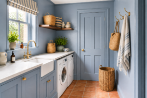
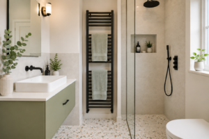
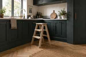


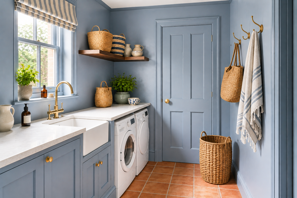
‘Colour drenching’ is a posh term for a very simple concept – painting everything the same colour. It involves a strong use of colour to create an intimate, immersive atmosphere. It’s not just about sloshing paint everywhere, though. In order to make your chosen space visually appealing and striking, you’ll need to think about the principles behind the trend.
Colour drenching has become one of the most recognisable interior decorating trends of recent years, but it’s much more versatile than its rather dramatic name suggests. Rather than introducing colour through a single feature wall or a few carefully chosen accessories, colour drenching embraces a shade across most — or sometimes all — of a room.
Walls, skirting boards, doors, architraves and even ceilings can all be painted in the same colour, creating an enveloping, cohesive effect. And although you might associate the look with deep greens, dramatic blues and rich burgundies, colour drenching can be equally effective with softer shades such as sage green, powder blue, plaster pink or warm ochre.
Done well, it can make an interior feel sophisticated, intentional and surprisingly spacious. Here’s how colour drenching works, which rooms it suits and how to introduce the look into your own home.
Quick Answer: What Is Colour Drenching?
Colour drenching is a decorating technique where one colour is used across several surfaces within a room, rather than limiting it to the walls. Typically, the walls, woodwork, doors, skirting boards and sometimes the ceiling are painted in the same shade or closely related shades.
The result is a more seamless interior with fewer visual interruptions. You can completely colour drench a room for maximum impact or use a more restrained version by painting the walls and woodwork together while leaving the ceiling a contrasting colour.
What Does Colour Drenching Mean?
Traditionally, rooms have been decorated using a fairly predictable formula: coloured or wallpapered walls combined with white ceilings, white skirting boards, white door frames and often white doors.
Colour drenching turns that approach on its head.
Instead of automatically reaching for white paint when you get to the woodwork, you continue the wall colour across architectural details. Skirting boards effectively disappear into the walls, doors become part of the scheme and the boundaries between individual surfaces are softened.
Take the idea further and the ceiling can join in too.
The aim isn’t simply to use lots of colour. It’s to create continuity.
This is one reason colour-drenched rooms can feel surprisingly restful, even when the colour itself is bold. Your eye isn’t continually stopping at contrasting lines around doors, windows, ceilings and skirting boards.
What Is Double Drenching?


If you’ve already come across colour drenching, you may also have heard the term double drenching.
Rather than relying on a single shade throughout the room, double drenching combines two or more closely related colours. You might, for example, use a deep olive on the walls with a darker forest green on the woodwork and ceiling, or combine terracotta walls with deeper rust-coloured doors.
The colours don’t necessarily need to be different strengths of exactly the same shade. The important thing is that they have enough in common to create a cohesive, immersive effect.
It’s a useful approach if you love the idea of colour drenching but worry that one colour everywhere could feel too uniform.
Why Has Colour Drenching Become So Popular?
One of the biggest attractions of colour drenching is that it makes a room look considered without requiring lots of decorative elements.
Rather than creating interest through feature walls, contrasting trims and numerous accessories, the colour itself becomes the main design feature.
It also works particularly well with the current move towards warmer, more characterful interiors. After years in which white, grey and neutral rooms dominated, homeowners have become increasingly confident about using stronger colour.
Colour drenching allows you to make that colour feel integral to the room rather than something added afterwards.
Benefits of Colour Drenching


Colour drenching doesn’t just create a strong design statement. It can be surprisingly practical too, making decorating simpler and even helping solve some common interior design problems.
It Makes a Big Impact on a Small Budget
You don’t necessarily need new furniture, flooring or accessories to transform a room — paint does most of the work. Taking a strong colour across the walls, woodwork and ceiling can make an ordinary space feel much more considered and distinctive.
If you’re happy with your existing furniture, it’s a relatively budget-friendly way to make a dramatic change.
There’s Less Cutting In
Using the same colour on walls, skirting boards, architraves, doors and ceiling means fewer contrasting edges to paint neatly, which can make colour drenching particularly appealing for DIY decorators.
You’ll still need to use the appropriate paint finish for each surface, but there’s less pressure to achieve perfect lines between coloured walls and white woodwork.
It Can Transform the Atmosphere
Because you’re surrounding yourself with colour, your choice of shade has a powerful effect on how the room feels.
Warm ochres, terracottas and earthy reds can make a cool north-facing room feel more inviting, while forest green, navy or burgundy can embrace its naturally subdued light. Cooler blues and greens can work beautifully in bright south-facing rooms.
Rather than choosing a colour simply because it’s fashionable, consider how you want the room to feel.
It Simplifies Colour Decisions
Colour drenching removes one of the trickier parts of decorating: deciding which colours to use on the walls, woodwork, doors and ceiling.
Instead, there’s one big decision to make: which colour? You’ll still need to choose suitable paint finishes and coordinate your furniture and accessories, but the basic decorating palette becomes much simpler.
It Can Make Small Rooms Feel More Spacious
Contrasting skirting boards, doors and ceilings create visual boundaries that emphasise a room’s dimensions. Painting everything the same colour softens these divisions and allows your eye to travel around the space more freely.
It won’t physically make a small room larger, but it can make it feel calmer, more cohesive and less fragmented.
It’s Great for Awkwardly Shaped Rooms
Loft rooms, sloping ceilings, alcoves, chimney breasts and changes in ceiling height can look busy when every element is picked out separately.
Using one continuous colour helps unite these features, allowing complicated architecture to recede rather than dominate the room.
It Can Disguise Unattractive Features
Not every architectural detail deserves attention. Radiators, multiple internal doors, fitted cupboards and uninspiring woodwork can become much less noticeable when painted to match the walls.
This works particularly well in hallways, where matching doors and frames to the walls can make a narrow or busy space feel considerably calmer.


Disadvantages of Colour Drenching
Colour drenching has plenty going for it, but there are a few potential drawbacks to consider before buying several tins of that fabulous dark green you’ve fallen in love with.
It Requires Commitment
Unlike adding colourful cushions or experimenting with a feature wall, colour drenching is difficult to try on a small scale. The effect relies on continuity, so you’ll usually need to paint the walls and woodwork at the very least, and potentially the doors, cabinetry and ceiling too.
If you decide you don’t like the finished result, that’s quite a lot of repainting.
You Can Try Tonal Drenching Instead
If using exactly the same shade everywhere feels too much, choose subtle variations of one colour. You might use a mid-green on the walls, a paler green on the ceiling and a deeper shade on the doors and skirting boards.
Known as tonal drenching, this retains the cohesive effect while adding a little more depth and definition. Schemes combining stronger related colours are sometimes called double drenching.
Colours Can Feel More Intense
A colour you love on a paint chart can feel surprisingly different when it surrounds you. Deep burgundy, for example, will have much more impact across the walls, ceiling and woodwork than it does on a small tester patch.
This doesn’t mean avoiding strong colours, but it makes testing your chosen shade in different lighting conditions particularly important.
Furniture and Accessories Matter
Against a largely single-colour backdrop, furniture, artwork, rugs, curtains and lighting provide valuable contrast, texture and personality. Ideally, your chosen paint colour should complement what you already own rather than leave you wanting to replace half the room.
Darker Rooms Need Good Lighting
Deep colour drenching can be wonderfully atmospheric, but it benefits from thoughtful lighting. Rather than relying on one central ceiling light, combine ceiling, wall, floor and table lighting to create highlights and bring out the richness of the colour after dark.
If the room currently has poor lighting, remember to factor any improvements into your decorating budget.
Can Colour Drenching Make a Room Look Bigger?

Surprisingly, yes.
You might assume that painting walls and woodwork in the same colour would make a room feel smaller, particularly if you’re using a darker shade. In reality, eliminating contrasting boundaries can help blur the edges of the space.
White skirting boards create a strong horizontal line around a room. White door frames highlight exactly where walls begin and end. A bright white ceiling creates another clear boundary overhead.
When these elements are painted in the same colour, some of those visual stopping points disappear.
This doesn’t mean every colour-drenched room will automatically look enormous, but the technique can make awkward or compact spaces feel more unified.
It’s particularly useful in small rooms where lots of contrasting architectural details can otherwise make the space feel visually busy.
Should You Colour Drench the Ceiling?
This is one of the biggest decisions you’ll need to make.
Painting the ceiling the same colour as the walls creates the most immersive version of the look. There is no obvious point where the walls stop and the ceiling begins, so the room can feel almost cocoon-like.
This can be particularly effective in:
- bedrooms
- snugs
- dining rooms
- home offices
- cloakrooms
- hallways
- rooms with awkward ceiling lines
However, you don’t have to paint the ceiling.
Leaving it white or choosing a paler coordinating colour gives the eye somewhere to rest and allows more light to bounce around the room.
There’s also a useful halfway house: choose a lighter or darker version of the wall colour for the ceiling. You’ll maintain the cohesive effect without making every surface identical.
Colour Drenching With Dark Colours


Deep colours are particularly effective for creating atmospheric interiors.
Think navy blue, forest green, aubergine, burgundy, chocolate brown or charcoal.
Using one of these shades across walls and woodwork can make a room feel luxurious and enveloping rather than gloomy — provided you work with the available light rather than fighting against it.
A north-facing sitting room that never receives strong sunlight, for example, isn’t necessarily going to become brighter simply because you paint it white. Embracing the naturally subdued atmosphere with a rich colour can produce a much more interesting interior.
Dark colour drenching also provides a fantastic backdrop for artwork, antique furniture, warm timber, brass lighting and colourful textiles.
Colour Drenching With Lighter Colours
You don’t need to be brave enough for aubergine walls and a matching ceiling to try colour drenching.
Lighter shades can create a gentler version of the same effect.
Consider:
- sage and eucalyptus green
- dusty blue
- soft peach
- plaster pink
- pale terracotta
- muted lavender
- buttery yellow
- warm stone
- soft aqua
Painting the walls, skirting boards and doors in one of these colours gives you the visual continuity of colour drenching while keeping the room relatively light.
It’s a particularly good introduction to the technique if you’ve previously relied heavily on white woodwork.
The Best Rooms for Colour Drenching

In theory, you can colour drench almost any room, but certain spaces lend themselves especially well to the technique.
Living Rooms
Living rooms give you plenty of opportunities to layer your chosen colour with contrasting furniture and textiles.
A petrol blue colour-drenched living room, for example, might be combined with a rust velvet sofa, walnut furniture, aged brass lighting and cushions incorporating ochre, raspberry and green.
The important thing is not to feel that everything else in the room has to match the walls.
In fact, introducing complementary colours and different materials will stop the scheme feeling flat.
Bedrooms
Bedrooms are ideal for deeper colour drenching because the cocooning effect can feel wonderfully restful.
Deep green, burgundy, navy, muted plum and earthy terracotta can all work beautifully.
If painting the ceiling feels too intense, try using the wall colour across the skirting boards, doors and fitted wardrobes instead.
Dining Rooms
If you have a separate dining room, colour drenching can give it a distinctive identity.
Dining rooms are often used primarily during the evening, making them good candidates for deeper shades that become particularly atmospheric under artificial light.
Warm wall lights, table lamps and pendant lighting can dramatically change the way a drenched colour appears after dark.
Hallways
Hallways are frequently overlooked when it comes to decorating, yet they’re excellent places to experiment with colour.
Painting the walls, doors, architraves and skirting boards in the same shade can simplify a hallway containing several doorways.
Rather than every white door standing out against the walls, the architecture becomes much calmer.
Small Cloakrooms and Downstairs Toilets
A downstairs loo is one of the best places to experiment with a bold decorating idea.
Because you don’t spend hours at a time in the room, you can afford to be more adventurous.
Try deep green, burgundy, cobalt blue or aubergine across the walls, woodwork and ceiling, then add patterned flooring, an interesting mirror and statement lighting.
Home Offices
Colour drenching can also give a home office a stronger sense of identity, particularly if the workspace forms part of another room.
Paint shelving or fitted cabinetry in the same colour as the walls and they will feel integrated rather than appearing as separate pieces of furniture.
Don’t Forget Built-In Furniture

One of the most effective ways to extend a colour-drenched scheme is to include fitted furniture.
Built-in bookshelves, cupboards, wardrobes and alcove units can all be painted in the wall colour.
This is particularly useful when you’re trying to make a small room feel less cluttered. Large cupboards can visually recede into the walls rather than dominating the space.
You can still highlight particular details with contrasting handles, knobs or decorative objects.
How to Choose a Colour for Colour Drenching
Choosing a colour becomes more important when you’re planning to use it across several surfaces.
Always test the shade in the actual room before committing.
Paint a large sample and look at it at different times of day. A colour that appears beautifully muted in bright daylight may become dramatically deeper in the evening.
Pay particular attention to the room’s orientation.
North-facing rooms tend to receive cooler light, while south-facing rooms generally experience warmer, stronger daylight. East- and west-facing rooms can change considerably throughout the day. Also consider the colours already present in flooring, furniture and permanent fittings. You don’t need everything to match, but the undertones should sit comfortably together.
Choosing the right colour, for example warm yellows, reds and oranges for a north-facing room with little natural light, can completely transform the atmosphere. If this is the type of room you’re decorating, take a look at our guide to the best colours for a north-facing sitting room before deciding on your shade.
Not sure which shade will work best in your space? Try our free Paint Colour Finder to discover colours suited to your room’s size, light, orientation and the atmosphere you want to create.
Use Different Paint Finishes to Add Depth

Colour drenching doesn’t necessarily mean using exactly the same paint finish everywhere.
In fact, varying the sheen is one of the easiest ways to give a single-colour room subtle depth.
You might use:
- matt or durable matt paint on the walls
- a suitable matt or flat finish on the ceiling
- eggshell or satin paint on doors and woodwork
- specialist furniture paint on cabinetry
Because light reflects differently from each surface, the colour will subtly change even when you’ve used the same shade.
Glossy or satin woodwork against matt walls can be particularly effective, creating gentle definition without introducing another colour.
Always use paint formulated for the surface you’re covering, especially on woodwork, radiators, kitchen cabinetry or areas exposed to moisture.
What About Radiators?
Radiators can be incorporated into a colour-drenched scheme too.
A large white radiator against a deep green or blue wall immediately interrupts the effect. Painting it in a coordinating colour can make it much less conspicuous.
You’ll need a suitable radiator paint or a product specifically approved for use on metal surfaces that become warm.
Alternatively, if you’re replacing radiators anyway, consider choosing coloured designs that complement your scheme.
How to Stop a Colour-Drenched Room Feeling Flat


When you’re using a lot of one colour, texture becomes particularly important.
Imagine a room with olive green walls, woodwork and cabinetry. If everything else is olive green too, the room may begin to feel monotonous.
Instead, introduce contrasting materials, like warm oak or walnut furniture, linen curtains, velvet upholstery, woven rugs, ceramics, glass, brushed brass, antique bronze and natural stone.
Pattern is useful too. Cushions, rugs, curtains and artwork can introduce secondary colours without undermining the overall scheme.
Plants are another easy addition, particularly in blue, terracotta, pink or burgundy rooms where natural greenery provides an effortless contrast.
Let Furniture Provide the Contrast
One of the advantages of colour drenching is that furniture can stand out beautifully against the uninterrupted backdrop.
Against deep blue walls, for example, you might use a mustard armchair or caramel leather sofa.
Burgundy walls could be combined with dusty pink, olive green or warm timber.
Soft pink walls work well with forest green, dark red, blue or walnut.
Rather than trying to find furniture that perfectly matches the walls, think about colours that will complement or deliberately contrast with them.
Colour Drenching Around Period Features


Colour drenching can be particularly striking in period properties.
Traditional mouldings, decorative cornices, ceiling roses, panelling and substantial skirting boards are usually highlighted through contrasting colours. Painting them the same colour as the surrounding surfaces changes the emphasis.
The details don’t disappear. Instead, light and shadow reveal their shape.
This can give ornate architectural features a surprisingly contemporary appearance while preserving their character.
If you’re lucky enough to have decorative plasterwork, try painting it in the wall colour before assuming it needs to remain white.
Using Colour Drenching in Modern Homes
The technique works just as well in contemporary properties.
In fact, modern rooms often benefit from the visual simplicity it creates.
Flush doors, simple skirting boards and fitted storage can almost disappear when painted to match the walls, allowing furniture, lighting and artwork to become the main focus.
In an open-plan space, colour drenching can also help define a particular zone. You might use one colour around the dining area or home-office section while keeping neighbouring spaces different.
Try Tonal Colour Drenching

If one identical shade feels too restrictive, use several tones from the same colour family.
For example:
- Sage walls could be paired with deeper olive woodwork and a pale green ceiling.
- Dusty blue walls might work with navy cabinetry and a softer blue overhead
- Terracotta could move from pale clay through rust to deep red-brown.
The room will still feel cohesive, but you’ll gain additional depth and definition.
Start Small If You’re Unsure
You don’t have to colour drench your largest living room on your first attempt.
Try the technique in a smaller space such as a cloakroom, hallway, utility room, home office or spare bedroom.
Another option is partial colour drenching.
Paint the walls, doors, skirting boards and architraves in the same shade but leave the ceiling alone. This removes many of the contrasting white lines without completely enveloping the room.
If you love the effect, you can always paint the ceiling later.
Common Colour Drenching Mistakes to Avoid


Although colour drenching is relatively straightforward, a little planning makes a big difference.
Choosing the colour from a tiny paint chip. A shade covering four walls and a ceiling can look dramatically different from the same colour on a small card. Test generously first.
Ignoring artificial lighting. Always look at samples after dark as well as during daylight.
Making absolutely everything match. Your furniture, curtains, cushions and accessories don’t need to be identical to the walls. Contrast gives the scheme personality.
Using the wrong paint finish. Walls, woodwork, metal and cabinetry have different practical requirements.
Automatically assuming dark colours make small rooms smaller. Sometimes the strong contrast created by white walls and woodwork is more visually disruptive than a continuous darker shade.
Forgetting texture. A successful monochromatic room relies heavily on differences in material, finish and surface.
Is Colour Drenching Just a Trend?

Colour drenching may currently have a fashionable name, but the underlying idea isn’t particularly new. Historic interiors have long used strong colours across walls, woodwork and architectural details.
What has changed is the willingness to move away from the default combination of coloured walls and brilliant white trim.
And that’s why colour drenching has more longevity than many decorating trends. You don’t need to recreate a particular fashionable look. At its simplest, it’s merely a different way of deciding where one paint colour should stop and another should begin.
Whether you choose soft sage, sunny yellow, sophisticated blue or dramatic burgundy, the technique can be adapted to your home and your own tolerance for colour.
Final Thoughts
Colour drenching is one of those decorating ideas that sounds far more daring than it necessarily is. Painting a ceiling dark blue certainly makes a statement, but painting pale green skirting boards to match pale green walls is colour drenching too.
The key is continuity.
By reducing the number of contrasting boundaries around a room, you can make the architecture feel calmer and the overall scheme more cohesive. From there, furniture, artwork, lighting, textiles and accessories can provide as much — or as little — contrast as you like.
If you’re nervous about abandoning white woodwork, start with one small room. Once you’ve seen how dramatically a matching door or skirting board can change the feel of a space, you may find yourself looking at the rest of the white paintwork in your home rather differently.
Happy painting!
1
Related
Read the full article here


