


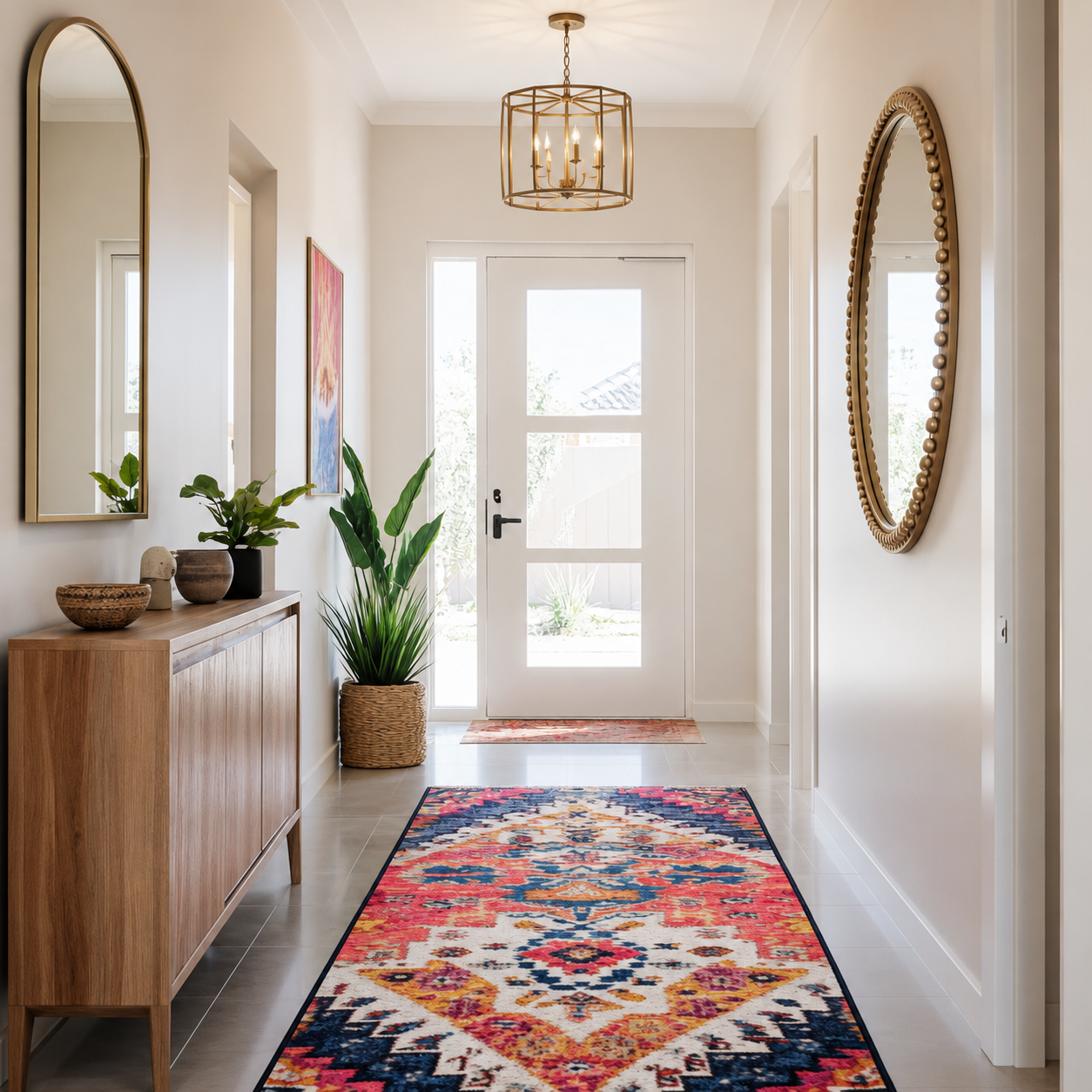
Your hallway sees more foot traffic, worse lighting, and more scrutiny than almost any other space in your home.
Yet most people treat it like an afterthought, slapping on whatever neutral they grabbed at the store without considering how shadows, narrow walls, and artificial light distort colour. A shade that looks serene in the living room can turn muddy and lifeless in a hallway. The wrong tone makes your entire home feel cramped and unwelcoming the second someone steps inside.
Hallways demand a smarter approach. The best paint colours for hallways need to handle low natural light, disguise scuff marks, make tight spaces feel open, and transition smoothly between rooms. It’s a taller order than it seems.
This guide walks you through the colours that actually deliver in real hallway conditions, plus how to pick the one that fits your home’s layout and light.
Why Hallway Paint Colour Matters More Than You Think
Most people assume hallways are just pass-through zones that don’t need much thought. That’s the exact mindset that leads to dark, uninviting spaces that drag down your entire home.
Hallways are high-traffic connectors that get seen constantly but rarely benefit from natural light. They’re also where first impressions form when guests enter your home. A poorly chosen colour absorbs what little light exists, emphasizes narrow dimensions, and shows every scuff and handprint within weeks. On the flip side, the right shade opens up tight spaces, bounces light around, and ties your home together visually.
The challenge is that hallways are shaped differently than other rooms. They’re typically long, narrow, and lined with doors that chop up wall space. Most have minimal or zero windows, meaning you’re relying entirely on artificial light, which shifts how colours read. A beige that looks warm in sunlight can turn gray and lifeless under LED bulbs. A white that feels crisp in a bedroom might glare harshly in a narrow, dark hallway with overhead lighting.
Understanding how your hallway’s specific lighting and dimensions affect colour is the difference between a space that feels intentional and one that feels like a mistake. Once you account for these factors, choosing a colour becomes straightforward.
Hallway Paint Colour Cheat Sheet
If you’re short on time, this quick guide will help you narrow down the best colour family for your hallway before exploring the detailed recommendations below.
| If your hallway is… | Consider these colours | Best finish |
|---|---|---|
| Dark with little natural light | Warm white, cream, soft greige | Durable matt or eggshell |
| Narrow and enclosed | Warm white, pale sage, soft blue | Durable matt |
| Busy family hallway | Mid-tone greige, warm taupe, soft stone | Eggshell or washable matt |
| Modern home | Greige, warm grey, muted white | Durable matt |
| Traditional home | Cream, linen, soft stone | Eggshell |
| Hallway with oak flooring | Warm white, beige, greige, sage | Eggshell |
| Hallway with grey flooring | Warm greige, mushroom, soft white | Durable matt |
Remember that no paint colour works in every home. The amount of natural light, your flooring, adjoining rooms and the type of lighting you use all influence how a colour will appear once it is on the wall.
How Hallway Orientation Changes Paint Colours
Just like any other room, the direction your hallway faces affects how paint colours appear throughout the day.
North-facing hallways
North-facing hallways often receive the coolest, weakest natural light. Colours can appear flatter and cooler than expected, making stark whites and cool greys feel rather lifeless. Warmer whites, creamy neutrals, soft mushroom shades and warm greiges usually produce a far more welcoming result.
South-facing hallways
South-facing hallways benefit from warm, bright daylight for much of the day. Almost any neutral works well here, although cooler greys and crisp whites can help balance the abundance of warm light if you prefer a fresher look.
East-facing hallways
Morning light brings warmth and brightness, but the space becomes noticeably cooler during the afternoon. Mid-tone greiges, soft greens and balanced warm whites remain attractive throughout the day without shifting dramatically.
West-facing hallways
West-facing hallways can appear fairly muted during the morning before becoming much warmer in the afternoon and evening. Soft taupes, gentle stone colours and warm neutrals tend to adapt particularly well to these changing conditions.
Understanding Undertones

Paint colours are rarely as simple as they appear on the sample card. Almost every neutral colour contains hidden undertones that become much more noticeable in hallways because of the limited natural light.
A grey may contain hints of blue, green, purple or brown. A white might have subtle yellow, pink or cream undertones. These hidden colours can completely change the mood of a hallway once they’re covering several walls.
As a general guide:
- Blue undertones create a cooler, contemporary appearance but may feel cold in dark hallways.
- Green undertones often feel calm and natural, pairing beautifully with timber flooring.
- Purple undertones can become surprisingly noticeable under artificial lighting and are usually best avoided in enclosed spaces.
- Brown or beige undertones create warmth and are among the most forgiving choices for family homes.
The safest approach is to compare several similar paint samples side by side. Small differences that seem insignificant in the shop become much more obvious once the paint is on the wall.
What is Light Reflectance Value (LRV)?
Light Reflectance Value, usually shortened to LRV, measures how much light a paint colour reflects back into a room. The scale runs from 0 (absolute black) to 100 (pure white).
For hallways, LRV can be particularly useful because these spaces often have limited daylight.
- High LRV (75–90): reflects the most light and helps brighten dark hallways.
- Medium LRV (50–75): provides warmth while still feeling reasonably bright.
- Low LRV (below 50): creates a richer, moodier appearance but may make a narrow hallway feel more enclosed.
LRV should never be the only factor when choosing paint, but it can help you compare similar shades. Two whites may look almost identical on a paint chart yet have noticeably different LRVs, making one feel considerably brighter once painted across an entire hallway.
Warm Whites That Actually Feel Warm

Pure white sounds like the safe choice, but in hallways, it often backfires. Stark whites amplify shadows, glare under artificial light, and make narrow spaces feel sterile instead of spacious. What you actually want is a warm white with enough depth to feel inviting without reading as cream or beige.
Swiss Coffee, Alabaster, and White Dove are three of the most reliable warm whites for use in hallways to create a seamless look. They have subtle yellow or beige undertones that soften the starkness while still reflecting maximum light in the best way. These shades work especially well in homes with warm-toned wood floors or trim because they complement rather than clash with the neutral colours.
In hallways with zero natural light, warm whites prevent that cold, basement-like feeling you get with cooler tones. They make the space feel finished and intentional without requiring bold colour commitment. However, if your hallway gets any natural light from adjacent rooms, test your sample in both morning and evening conditions. Some warm whites can skew too yellow under certain LED bulbs, which makes them feel dingy instead of fresh.
The key is choosing a white with just enough pigment to avoid starkness but not so much that it stops feeling like white. Done right, a warm white hallway becomes a neutral backdrop that makes your entire home feel cohesive and well-lit.
Greige: The Chameleon Colour for Tricky Hallways

Greige is the hybrid nobody asked for but everyone needs. It sits perfectly between gray and beige, borrowing warmth from one and sophistication from the other.
Here’s why it can be one of the best hallway paint colors:
- It adapts to your lighting instead of fighting it. Greige reads warmer under incandescent or warm LED bulbs and cooler under daylight-temperature lighting, which means it doesn’t look off no matter what fixtures you install.
- It hides imperfections better than pure white or gray. Scuffs, dings, and handprints blend into greige tones instead of standing out like they do against bright white walls.
- It transitions smoothly between rooms that have different colour schemes. A greige hallway won’t clash with a blue bedroom or a green living room because it’s neutral enough to complement anything.
Top greige picks for hallways include Repose Gray, Agreeable Gray, and Edgecomb Gray. Each leans slightly different depending on your undertones, but all three handle low light beautifully. Repose Gray is the truest greige with balanced undertones. Agreeable Gray skews slightly warmer and works well with beige or tan accents. Edgecomb Gray has a hint of yellow that makes it feel cozier in windowless hallways.
The biggest mistake people make with greige is assuming all greiges are the same. They’re not. Some lean purple, some lean green, and some shift wildly depending on your lighting. Always test a sample on your actual hallway wall and observe it over 24 hours before committing. What looks perfect at noon might look completely different at 8 PM under your overhead lights.
Soft Greys That Don’t Turn Blue or Purple

Grey became the go-to neutral for modern homes, but it’s also the colour that causes the most regret in hallways. The problem isn’t grey itself; it’s that most greys have sneaky undertones that only reveal themselves in low-light, narrow spaces.
Cool greys with blue or purple undertones can make hallways feel cold, dark, and uninviting. In a room with windows, those undertones might read as sophisticated. In a hallway with only artificial light, they turn muddy and depressing.
What you need to create a warm welcome in your home are warm grays or true grays with minimal undertones. For example:
- Mindful Gray is a soft, warm gray that stays neutral without shifting blue. It works beautifully in hallways that connect to rooms with cooler colour palettes.
- Revere Pewter is technically a greige but reads more gray in low light. It’s one of the most forgiving shades for hallways because it balances warm and cool without committing fully to either.
- Stonington Gray is a true gray that leans just slightly warm. It’s ideal for homes with lots of white trim because it provides contrast without feeling heavy.
The trick with gray hallways is lighting temperature. If you’re using cool-toned LED bulbs (5000K or higher), even a warm gray can look blue. Swap in warm-toned bulbs (2700K to 3000K) and suddenly the same paint reads completely differently. Test your gray samples with the actual bulbs you plan to use, not just in daylight or with old incandescent fixtures.
Grey hallways can look incredibly polished and modern, but only if you match your paint undertones to your lighting setup. Skip that step and you’ll be repainting within a year.
Soft Blues and Greens That Expand Small Spaces

Colour in a hallway isn’t just allowed; it’s often the smartest move. Soft blues and greens create the illusion of depth and openness in ways that neutrals simply can’t. They trick the eye into perceiving more space because they recede visually instead of advancing like warmer tones.
Pale blues like Sea Salt, Rainwashed, and Palladian Blue bring a calm, airy quality to narrow hallways. They feel especially cohesive in homes with coastal, transitional, or modern farmhouse aesthetics. These shades work best in hallways that get some borrowed natural light from adjacent rooms because they need a bit of brightness to avoid looking gray or washed out.
Soft greens like Clary Sage, Comfort Gray (which reads green in certain lights), and Silver Strand add warmth while still creating that spacious, airy effect. Greens are particularly effective in homes with wood tones or natural textures because they complement organic materials beautifully.
The key with blues and greens in hallways is saturation. You want barely-there colour, not bold statement dark green or dark blue shades. Highly saturated blues or greens will make a narrow hallway feel even more enclosed. Stick to shades that are 50% to 75% lighter than what you’d use as an accent wall in a living room.
One often-overlooked benefit of soft blues and greens is that they don’t show dirt and scuffs as obviously as whites and light grays. The subtle colour variation disguises imperfections, which means less frequent touch-ups in high-traffic areas.
Warm Neutrals That Handle Artificial Light Like Pros

If your hallway relies entirely on artificial light, warm neutrals are your safest bet. They’re specifically designed to look good under the yellow-toned glow of incandescent and warm LED bulbs, which is exactly the lighting situation most hallways face.
Think soft tans, warm taupes, and creamy beiges. These neutral shades absorb and reflect artificial light without glaring or turning muddy. They create a cozy, finished look that makes your hallway feel like an intentional part of your home rather than an overlooked afterthought.
Some of the top warm tones in this category include:
- Accessible Beige: A warm greige-beige hybrid that stays neutral without feeling cold. Works beautifully with both traditional and modern decor.
- Kilim Beige: A soft, sandy beige with enough warmth to prevent that institutional feeling. Pairs perfectly with white trim and dark wood floors.
- Balanced Beige: True to its name, it balances warm and cool undertones, so it adapts to different lighting throughout the day.
Warm neutrals are the perfect choice if your hallway opens into multiple rooms with different colour schemes. A warm tan or taupe acts as a visual bridge that ties everything together without competing with bolder colours in adjacent spaces.
The downside? Warm neutrals can sometimes read as boring if you don’t add visual interest through trim colour, artwork, or lighting fixtures. But if you’re looking for a colour that absolutely will not fail in small hallways, or a windowless hallway with artificial light, warm neutrals are your answer. They’re the reliable friend who always shows up and never causes drama.
Choosing Paint Colours to Complement Your Flooring
Your flooring occupies almost as much visual space as your walls, so the two need to work together rather than compete.
Light oak flooring
Warm whites, soft greiges, pale sage greens and creamy neutrals all enhance the natural warmth of oak without overwhelming it.
Dark wood flooring
Deep walnut or mahogany flooring is an excellent choice for lighter wall colours that provide contrast. Warm whites, soft stone shades and gentle greiges keep the hallway feeling balanced.
Grey wood or laminate flooring
Grey flooring pairs best with warmer wall colours that prevent the space feeling cold. Mushroom tones, warm greiges and creamy whites soften the overall look.
Natural stone or slate
Stone flooring works beautifully alongside earthy colours such as taupe, olive green, muted clay and warm off-whites that reflect the natural materials.
Whatever flooring you have, always compare paint samples against it rather than in isolation. Even an excellent paint colour can feel wrong if its undertones fight against the floor beneath it.
Complete Hallway Colour Palette Ideas
Rather than choosing a wall colour on its own, consider the whole scheme.
Warm Contemporary
- Walls: Accessible Beige
- Trim: Soft warm white
- Flooring: Natural oak
- Furniture: Slim oak console table
- Accessories: Black-framed mirror, woven runner, leafy green plant
Calm Coastal
- Walls: Sea Salt
- Trim: Crisp white
- Flooring: Pale timber
- Accessories: Linen runner, woven baskets, brushed brass lighting
Classic Traditional
- Walls: Creamy
- Trim: Linen White
- Flooring: Original timber boards
- Accessories: Antique brass wall lights, traditional runner, framed artwork
Modern Minimalist
- Walls: Repose Gray
- Trim: Matching wall colour
- Flooring: Pale engineered oak
- Accessories: Black metal lighting, simple mirror and minimal styling
Thinking about your hall as a complete design scheme rather than simply selecting a paint colour often produces a more cohesive and professional-looking result.
Off-Whites and Creams for Traditional Homes

If your home has traditional architecture, off-whites and creams often look more cohesive than stark whites or modern grays. These colours have history and depth, which complements architectural details like crown molding, wainscoting, and classic trim details.
Shades like Simply White, Decorator’s White, and Linen White bring a soft, elegant quality to hallways in older homes. They’re white enough to brighten spaces but not so bright that they clash with antique finishes or warm wood tones. In homes with original hardwood floors or vintage light fixtures, these shades feel like they’ve always been there.
Creams like Navajo White, Creamy, and Muslin go a step further into warmth. They work especially well in hallways with rich wood trim or doors because they complement rather than contrast. These shades also handle lower light levels gracefully, never looking dingy or yellow the way some builder-grade beiges do.
One important note: off-whites and creams need the right trim colour to shine. If you pair them with bright white trim, the walls can look dirty or yellow by comparison. Either paint your trim the same shade for a monochromatic look, or choose a trim colour that’s only slightly lighter so the contrast feels intentional rather than accidental.
Off-whites and creams are also one of the best paint colors as they are forgiving with imperfections. They don’t show every little ding and scuff mark the way pure white does, which is a practical advantage in a high-traffic hallway. The overall effect is warm, welcoming, and timeless, which is exactly what traditional homes call for.
Colour Drenching: A Modern Way to Transform a Hallway
One of the biggest decorating trends in recent years is colour drenching, where the walls, ceiling, woodwork and even doors are painted in the same shade.
This approach works particularly well in hallways because it reduces visual interruptions. Instead of your eye stopping at every door frame and skirting board, the entire hallway flows together, often making a narrow space feel surprisingly larger.
Warm greiges, muted greens, mushroom shades and soft taupes are particularly effective for colour drenching because they create depth without becoming overpowering.
If painting everything the same colour feels like too much of a commitment, consider using the same shade throughout the hallway while selecting a slightly different finish. For example, durable matt on the walls and eggshell on the woodwork creates subtle contrast while maintaining the seamless effect.
Hallway Colour Trends

While timeless neutrals remain the most practical choice for many homes, several colour trends are becoming increasingly popular for hallways.
Here are a few of the best hallway paint ideas of recent years:
Warm mushroom tones continue to replace cool greys, offering a softer, more inviting feel.
Muted olive greens introduce colour while remaining understated enough to work as a long-term neutral.
Soft clay and putty shades bring warmth without appearing overly beige, making them ideal for contemporary homes.
Stone-inspired neutrals remain a favourite because they pair effortlessly with natural timber, textured fabrics and black metal accents.
Perhaps the biggest trend of all is moving away from brilliant white hallways towards softer, warmer neutrals that create a more welcoming first impression while still feeling light and spacious.
How to Test Paint Colours in Your Actual Hallway

Looking at paint chips under store lighting tells you almost nothing about how a colour will perform in your hallway. The only way to choose confidently is to test samples in the actual space, under your actual lighting, at different times of day.
Here’s the process that actually works and is recommended by designers:
- Buy sample pots of your top 3 to 5 colours. Don’t skip this step to save money. Repainting an entire hallway costs far more than a few sample pots.
- Paint large swatches directly on your hallway walls. Use at least a 2-foot by 2-foot square so you can see how the colour reads at scale. Painting on poster board doesn’t work because the colour interacts with your existing wall colour and lighting in ways a separate board won’t show.
- Observe your samples at different times of day. Check them in morning light, afternoon light, and evening with your artificial lights on. Colours shift dramatically depending on time and light source.
- Look at your samples from different angles. Walk toward them, walk away from them, and view them from where adjacent rooms connect. Hallways are movement spaces, so you need to see how the colour reads from multiple perspectives.
- Live with your samples for at least 48 hours before deciding. Your eyes and brain need time to adjust. A colour that feels too bold on day one might feel perfect on day two.
Pay special attention to how your samples look right next to doorways and where your hallway opens into other rooms. You want a colour that transitions smoothly, not one that creates a jarring contrast every time you walk from one space to another. If your hallway connects a blue bedroom and a beige living room, your hallway colour needs to feel cohesive with both.
Testing different colors takes time, but it eliminates guesswork and regret. It’s the difference between a hallway you love and one you tolerate until you finally repaint it.
Avoiding the Biggest Hallway Paint Mistakes
Even with the right colour, poor execution can ruin the result. Here are the mistakes that trip up most DIYers and how to avoid them:
- Mistake 1: Choosing colour based on a tiny colour paint sample. Paint samples or chips are useful for narrowing options, but they’re too small to show how a colour will read on a full wall. Always test samples in large swatches before committing.
- Mistake 2: Ignoring your lighting temperature. The warmth or coolness of your light bulbs changes everything. A warm beige under cool LED lighting will look gray and depressing. Match your paint undertones to your bulb temperature.
- Mistake 3: Using flat or matte finish in a high-traffic hallway. Flat paint shows every scuff mark and can’t be wiped clean. Use eggshell or satin finish instead. They’re durable, washable, and still look sophisticated.
- Mistake 4: Painting over dark colours without proper primer. If you’re going from a dark colour to a light one, use a high-quality primer. Otherwise, you’ll need four or five coats to achieve full coverage, and the old colour will still bleed through.
- Mistake 5: Skipping the second coat to save time. One coat almost never provides even coverage, especially in hallways with artificial light that highlights every streak and thin spot. Budget time for two full coats.
- Mistake 6: Choosing a colour that clashes with your flooring. Your hallway floor is a permanent fixture. If you have warm oak floors, cool-toned grays will look off. If you have gray tile, warm beiges might clash. Pick a wall colour that complements your flooring, not fights it.
These mistakes are easy to avoid with a bit of planning and patience. Take your time, test properly, and use quality materials. Your hallway will look professionally painted instead of hastily DIYed if you take the time to do a good job and find the best color for your space.
Where To Buy Hallway Paint
Whether you’re looking for an affordable emulsion or a premium designer finish, there are plenty of excellent places to buy quality paint. For everyday decorating, Dulux and Dulux Decorator Centre offer an extensive range of colours, tester pots and durable finishes, along with professional colour-matching services.
If you’re after luxury paint with rich pigments and carefully curated colour palettes, brands such as Farrow & Ball, Little Greene, COAT Paints and Lick are popular choices.
Many independent decorating merchants, including Decorating Centre Online and B&Q, also stock multiple premium brands, making it easy to compare colours and finishes before you buy.
Wherever you shop, it’s worth ordering tester pots first so you can see how the colour looks in your hallway throughout the day.
Frequently Asked Questions

What is the best paint colour for a narrow hallway?
Warm whites, soft greiges and pale sage greens are excellent choices because they reflect light well and help the walls feel less enclosed.
Should hallways be lighter than adjoining rooms?
Not necessarily. Many designers use hallways as transitional spaces, choosing colours that complement neighbouring rooms rather than matching them exactly.
Which colours hide marks and scuffs best?
Mid-tone greiges, taupes, soft greens and stone colours are generally more forgiving than brilliant white walls.
What paint finish is best for hallways?
A durable matt or eggshell finish is usually the best option. Both offer good durability while remaining easy to wipe clean in busy family homes.
Should ceilings always be painted white?
White ceilings remain a classic choice, but painting the ceiling the same colour as the walls can create a softer, more contemporary appearance, particularly in smaller hallways.
Is white still fashionable for hallways?
Absolutely, although today’s preferred whites are usually warmer and softer than the brilliant whites that were popular a decade ago.
Can you use dark colours in a hallway?
Yes. Dark greens, deep blues and charcoal shades can look stunning in larger hallways or spaces with good lighting, especially when paired with lighter flooring and well-positioned mirrors.
Should doors and skirting boards match the wall color?
Matching the woodwork to the walls creates a calm, seamless appearance. Contrasting white trim provides a more traditional finish, while black or dark-painted door frames and doors create a bold contemporary statement.
Final Thoughts
The best hallway paint colours aren’t simply the ones that are trending or the shade that looked good on a tiny paint card in the DIY store. It’s the colour that works with your home’s natural light, complements your flooring, suits your décor and stands up to the demands of one of the busiest spaces in the house.
Whether you choose a warm white to brighten a dark entrance, a versatile greige that ties every room together, or a calming sage green that adds subtle character, taking the time to understand undertones, lighting and finish will make all the difference. Don’t be afraid to test several samples, view them at different times of day and see how they look alongside your flooring, doors and furnishings before making your final decision.
Remember that paint is only one part of creating a welcoming hallway. Thoughtfully chosen lighting, mirrors, artwork, runners and storage furniture all work together to transform what is often an overlooked passageway into a bright hallway space that feels stylish, practical and inviting.
A well-designed hallway sets the tone for the rest of your home. Choose a colour that reflects light, complements your home’s character and makes you smile every time you walk through the front door. Get it right, and even the smallest hallway can become one of the most welcoming spaces in your home.
0
Related
Read the full article here